
Winners
1) Chronodiver Lokii
2) Blowtoes
3) Neon Ness
Honorable Mention to Chaco
COMMENTS
CRASHiC:
Adherence to Prompt -
Skill -
Ingenuity/Style -
Aesthetics -
Infinite Emerald:
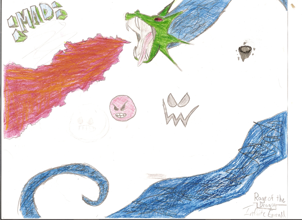
Adherence to Prompt -
Skill -
Ingenuity/Style -
Aesthetics -
SHeLL:
Bowser Mad
Adherence to Prompt -
Skill -
Ingenuity/Style -
Aesthetics -
Guus:
The Blue Screen of Death
Adherence to Prompt -

Skill -
Ingenuity/Style -
face added some more rage to it.
Aesthetics -
SoniKupo:
Blue Wreck
Adherence to Prompt -
Skill -
Ingenuity/Style -
Aesthetics -
~ZIO~:
Nameless
Adherence to Prompt -
Skill -
Ingenuity/Style -
Aesthetics -
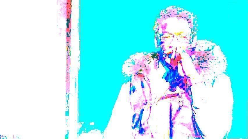
Chronodiver Lokii:

Adherence to Prompt -
Skill -
Ingenuity/Style -
Aesthetics -
I like your style. I do feel some of the blurs in the water are off, and some of the thicker water strokes outside of the main mass just look like the paintbrush tool, and nothing else to it. The clouds to the left feel too much and are weighing the piece down, and they are very simple considering the rest of the picture.
The person’s shoulder’s are a bit too crooked imo, personal style or not. And the shine line in the hair doesn’t really make sense. I’m not sure if the top of the hair is supposed to be linked to the water?
Overall a very nice picture.
Chaco:
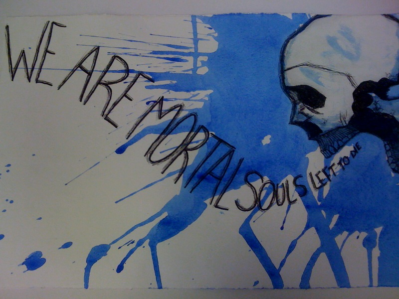
Adherence to Prompt -
Skill -
Ingenuity/Style -
Aesthetics -
However, I don’t get much of a feeling of rage from this. More along the lines of despair, isolation, and feelings of giving up. Perhaps if you had fiddled with the skull’s brow line a bit to add in more of an angry feel to it, that would have helped. Also not a fan of the lines above the teeth. On the bottom jaw, it looks like you are viewing it at a different angle than the rest of the skull. Also, and this may be getting a bit nit-picky, the teeth shapes are a bit wrong. The best advice I’ve ever gotten is to not draw them, but shade them in. It gives a more realistic look, and I think it makes you think more about how they sit together. Overall, I think the skull is very good though.
Mota:

Adherence to Prompt -

Skill -
Ingenuity/Style -
Aesthetics -
angry and frustrated. Lol.
Be careful when using filters and photoshopping a picture together.
Make sure the filters make sense with the photo. And be careful
because you cut off part of your right shoulder, and your left
shoulder drifts into nothing and there’s a double line at the bottom
of it. Also, with using that filter, you make the piece's flow
disjointed. Come chess pieces are affected, others are totally normal.
Also, there's some reddish/orangish fuzz surrounding some of the
pieces and the checkerboard squares. Try to take a bit more care into
cleaning an image up.
I do like the angle you took this picture at. The queen being right in
the middle of your face is a bit distracting, though.
Blowtoes:

Adherence to Prompt -
Skill -
Ingenuity/Style -
. A dramatic take on being overwhelmed and angered. I like it.
Aesthetics -
unique idea, nicely executed. Bubbles are a pain to draw, and you did
a superb job. Love the bubbles coming out of the nose and the mouth.
You pay attention to details in your drawings, shown by the fact that
some of the bubbles are distorted and running into the crease in his
cheek. You really get a feel for the flow of them, and I can almost
hear this man screaming and the bubbles filing out. The whole shape of
his head is great. The mouth is fantastic The nose also, which can be
very difficult. I'm not a fan of the eyebrow. It just feels "there",
and drawn on, and it’s too far forward. Your coloration is great; you really feel like you're
underwater, and I love the greens you added in to shading his head.
The shading could be better. A lot of the definition around the nose
and eyes just seem like too thick of lines. Also, some shading seems
to be missing(the crease in the eyelid). With lighting at that angle,
I feel there should be more shading under the brow and on the chin.
His eyeball also could use shading. I love that you made sure his dome
wasn't just a flat color, just like a real person. And all the lines
and shading you did do are placed perfectly and you really get a feel
for his expression. This is incredibly difficult to do.
As far as composition, I love the placement of everything from him to
the right. I feel like most of the blue to the left is just too much
dead space. Also, I feel like this space causes him to lose his cheek
and chin's definition. They become flat and fade out into nothing.
MLEsis:

Adherence to Prompt -
Skill -
Ingenuity/Style -
I would never think of the idea of drawing satire for this contest, but you did it and managed to follow the prompt too. The idea of Wal-Mart as a huge company killer is quite true and you displayed it well.
Aesthetics -
The painting itself lacks shading, or real depth beyond the basic perspective. The signs are totally flat. The grass just ends at the end of the sign. The text is pretty nice, but the “out” looks just written on and doesn’t follow the same perspective.
I like the colors in the sky, and the wave of the flag is nice. I also thought the idea of the dying grass was a good one.
Neon Ness:

Adherence to Prompt -
Skill -
. However, I would you to try shading with multiple colors instead of just using a darkened shade of the original color; it adds a certain zest to the picture when done correctly.
Ingenuity/Style -
Aesthetics -
Shading and highlighting in general still needs work, though. The blue shell angel’s hands have almost no definition to them. Same with the feet. Mario is getting struck by lightening, yet the hand closest to him’s lightest color is the same peach color as the body. And the hand hanging back should be darker. I can see keeping things lighter because it’s a god-like being, but there really are just no brights aside from the toga.
Mario’s outfit is essentially only two different shades and feels flat. Blue Shell Angel’s toga is nice, especially the sash part. The shell could have some more definition. Maybe have some of the gold from the halo reflecting onto the white wings and a bit of the shell.
I’m not really sure what’s going on with the clouds behind the blue shell angel. I can’t tell if it’s supposed to be part of a cloak, a tail, or a distinguishably shaped cloud.
Mewter:
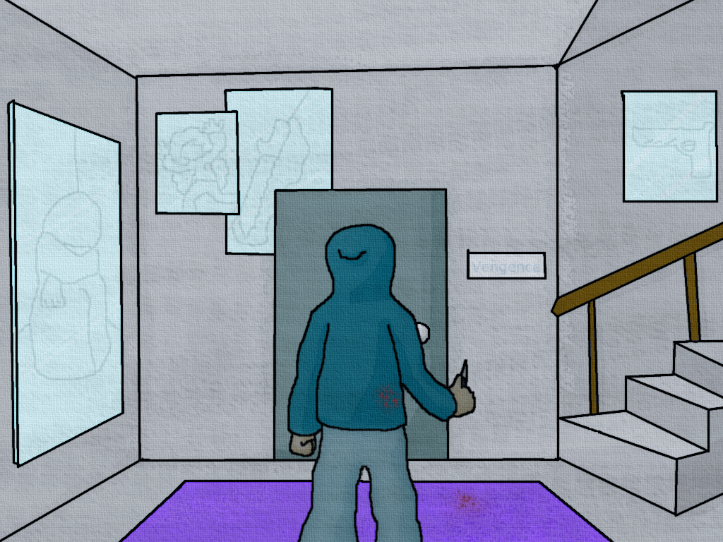
Adherence to Prompt -
Skill -
Ingenuity/Style -
Aesthetics -
In the corners of the room, and corners of the poster, you need to make sure the lines meet up and are straight. Also, the one poster is just kind of cut off by the door, which doesn’t really make sense. More shading could be used in the picture in general. The door wouldn’t have that rounded shading on it, depending on what’s lighting the room.
The placement of the guy in the room feels right. He is also decently proportioned. Maybe try to put more detail in the clothes. I like that you gave the painting to the left some depth instead of just making it flat.
Lastly, lay off using filters until you know how to use them. I advise most people to not use filters until they are very good or amazing at art basics, because a filter can be a one way ticket to making your piece look amateur and unnatural. Your picture is an obvious computer drawing. It doesn’t look nice to have the canvas filter over the whole thing.
N9NE:

Adherence to Prompt -
Skill -
Ingenuity/Style -
Aesthetics -
I really liked how you incorporated the color blue for this prompt. Policemen wear blue, and it’s something we all know about and can relate to. For the anger portion, it’s slightly iffy. The stance and the billy club indicate that it could be a situation of anger and violence. Add in the police tape and you also get a sense of hostility. However, the most expressive part of the face is the eyes, and his eyes are pretty normal looking. Creating wrinkles between the brows and lowering the brows could help achieve a more expressive, angry looking face.
Your coloration is very good and has a nice wide variety. I appreciate the variety in the skin, too, as people are not just one color. Be wary of using black to darken or shade something. This is true for colored pencils and even paints. It can dull the color. The area right below his hat is just devoid of any color, when I assume it is just supposed to be the shade from the hat.
Some other color or shading concerns: Inside of the mouth is just a wall of pink. It needs some darks, especially around the roof of the mouth. The eyes aren’t dark enough (pupils).
Overall a pretty good job drawing the folds in the clothes. Anatomy is pretty good. The fingers on his left hand need to be more natural looking. After the first knuckle, they just go straight. The other hand looks pretty good. I like its color. Also, the mouth should be a bit rounder if he has no teeth showing. If you kept that shape, it would make sense if there were teeth visible.
I like the way you incorporated the printed out police signs by actually coloring over them instead of printing them and stick them on, but I feel the picture would’ve had more oomph if it actually had a full background.
Congrats to all that entered! I wasn't lying when I said it was the best set of entries we've had so far. Keep up the good work! If you want to talk to me about your individual piece in real time, if you can catch me on AIM I'm all yours. Also, thank you to the judges who took their sweet *** time doing these awesome comments. *brofist* And until next time, remember to Write with your Power!
1) Chronodiver Lokii
2) Blowtoes
3) Neon Ness
Honorable Mention to Chaco
COMMENTS
CRASHiC:
Adherence to Prompt -
Virg
- The man definitely has a sliver of anger in him. I see blue as wellLivvers
- I’m not really getting any feelings of anger from this. Maybe being disjointed, distressed, losing yourself or falling apart, but not anger. Anger can be associated with those emotions, but I just don’t feel it here. The blue is present, though =)Frown
- Skill -
Virg
- It looks like the satellite box mixed up the color input signals for a second. I'm sure more was put into it than that, but it appears to be bare bones on the skill department.Livvers
- It doesn’t really look like a ton of effort was put into it. Kinda just looks like you put it into a paint program and used some filters or something. I do enjoy the placement of you(?) and the space to the left.Frown
- Ingenuity/Style -
Virg
- That said, it is a unique take; very post modern in color choices and minimalist use of borders (which I do like). Don't see that very often in entries like these.Livvers
- Intriguing style. I feel like it started on a good idea, but that it got lost somewhere. I’ll expand in aesthetics.Frown
- Aesthetics -
Virg
- It is an interesting piece; it is both alluring to the eye but also a bit abrasive. It's alluring because of the uniqueness and blend of colors, you have to really look at it to take it all in. It's a bit abrasive in that where the picture is most focused (the man's face and hands) is also the most chaotic and difficult to fully comprehend. Yes, it's a hand with a cigarette in it, but so what? It doesn't have the benefit of being detailed or fully visible, so the eye is inclined to wander away from it. You don't want the focus of your piece to make the viewer turn away.Livvers
- Like I said, I feel it started off on a good idea. It just doesn’t look like enough attention was paid into the colors you used, where you used them, the pose, and how you distorted the image. It comes out a bit lazy looking. Again, basically it just looks like you messed with a filter. I do enjoy the emptiness off to the left and the static/fuzz moving in.Frown
- Infinite Emerald:
Adherence to Prompt -
Virg
- It technically adheres to it...Livvers
- Blue dragon who’s angry. Lookin’ good. I do think you should have left out the faces and the words, and let the main imagine speak for itself. The extras just make it seem like something you tagged on to make sure we got it. I also would have focused on the dragon’s expression and pose here. He really just looks like he’s flying around blowing fire. While his wide mouth and the fire help contribute to the feeling of anger, his eyes are blank. For the pose, my best advice would be to google image similar looking animals with the word “angry” before them(like a snake). Often time animals like that, when provoked, go into an “S” shape.Frown
- Skill -
Virg
- Going to be blunt here; not much skill in the piece. There are no gradients in shading nor is the shading that does exist remotely solid (which I assume you were going for).Livvers
- Biggest advice I have is try to pay more attention to making your coloring even and your outlines more solid. That’s a good base point to work up from. Also, I’ll reiterate again about using reference shots. This doesn’t mean copy something, but use another image as a way to feel out how you should draw and color something. In this case I’m talking about the fire. Actual fire isn’t red, it’s mostly oranges and yellows. Good job on drawing the dragon’s mouth. That angle can be tricky.Frown
- Ingenuity/Style -
Virg
- The composition doesn't feel thought out at all. The dragon goes off the piece and back on... why? What does that accomplish? I understand the written mad and mad faces, but it feels like you haphazardly threw them in there to fill up space. Next time, plan out what you are going to do; everything seems like a good idea in your head. It's not until you actually get it on paper that real problems begin to expose themselves. Take a couple of papers and just sketch out a handful of designs. See what works and what doesn't, combine the good and nix the bad and then get working.Livvers
- I must admit, there’s not much there for ingenuity. It’s pretty straightforward, but it also seemed to require thrown in drawings that don’t really relate to get the message across.Frown
- Aesthetics -
Virg
- My main sticking point on aesthetics is "Is the piece enthralling from both far and away?" From far because it shows the design, the composition and color choices, are very well done. The later to show that the detail and skill is impressive under high scrutiny. This piece doesn't have either; there is a lot of very vacuous empty space and the detail and intricacies don't hold my eyes down.Livvers
- Work on including a background, and not cluttering your image up with random side drawings. Try to keep in mind how everything could relate together in the picture. I do enjoy how the dragon flows in and out of the frame. Frown
- SHeLL:
Bowser Mad
Adherence to Prompt -
Virg
- Anger? Yes. Blue? Maybe a colorless blue...Livvers
- No blue in the picture, but I do get a feeling of rage from this. The color helps this, which destroys the point of the two sides of the prompt being together. Try to challenge your artistic abilities and mind and not go with the most used color for anger.Frown
- I see anger, but I see no blue whatsoever. While blue was a secondary prompt, it was still important.Skill -
Virg
- It's a simple design, but there is skill required in making the stencil and splattering paint (there actually is, for people that think there isn't).Livvers
- I enjoy that you took the time to really work through the image you captured and make it your own, as opposed to simply cutting out and pasting an exact image. The splatterwork is good, and it’s nice that you can tell care was taken into the direction it was going. Some of the linework around Bowser is a bit messy, especially around the hands and belly, and could probably have been reworked a bit. The white on the face, and first three spikes on the collar look very good.Frown
- You sure went through a lot of steps to get this done. I can see why you are skilled with splattering since you have made three other similar pieces like this one. Bowser's body was also well made. If there's a thing I have to point out, it seems as if you didn't put a lot of effort into his hands. Correct?Ingenuity/Style -
Virg
- I think this is a very stylish piece. The hot, angry colors splattered over the solid black figure gives it this unique felling, almost as if the anger just boiled over and exploded onto the page. I like that. It stands out.Livvers
- I think it’s a very good style you have going here. I also enjoyed reading the process you took to make this image. I do feel the white could have been a bit more bold in places. I think it could have helped the piece to really stand out. Still, very cool how the paint seems to explode out from Bowser. Frown
- Your method of painting is definitely interesting. It does project the anger better than most other entries, but partly because you take the easy way out and use orange instead of blue.Aesthetics -
Virg
- I'm a sucker for contrasts; I really like the orange/black contrast. It's not overdone and just focuses all intent on the figure (as well as encompassing him like a flame). Even stepping back a few feet, it still has appeal to it. The orange border also sets the piece; even though there is a lot of white space, it doesn't reach the borders and make the piece feel incomplete. Well done.Livvers
- The piece is very nice to look at. The colors work well together. The image doesn’t feel cluttered despite all that’s going on in it, and Bowser really stands out. I’m not sure if the more intense color around his mouth was intentional (I believe it is), but it is fitting and looks great.Frown
- I really like this. The splatter makes the painting come alive in a really cool way Guus:
The Blue Screen of Death
Adherence to Prompt -
Virg
- Yes and yes.Livvers
- Frown
- All goodSkill -
Virg
- Photoshop was used, so there was some skill, though admittedly basic.Livvers
- Frown
- After looking at the way you made this, it seems as if you took the long way around. It could have been made in Photoshop with ease, but you only had access to Paint. Still, it's well executed for such simple softwareIngenuity/Style -
Virg
- It is a clever piece and one that was immediately understood. However, it's kind of a one hit wonder in that regard; once I got the reference, the allure of the entry just dissipated. It needs a little more to tide my hungry eyes over.Livvers
- Frown
- Using the bluescreen as a symbol of anger is a really, really clever idea. I feel like a bluescreen alone would have made it, but I guess that face added some more rage to it.Aesthetics -
Virg
- As I touched on in the style portion, the picture has no lasting allure; it's a brief flash in the pan and has no long lasting sustenance. That's not to say it doesn't have appeal, but art is supposed to last and only catching a few brief seconds of interest isn't a characteristic of great aesthetics.Livvers
- I like the idea you had with this, and I thought it was pretty funny. It also sticks to the prompt. However, it falls short in the other categories. It looks like a webcam quality photo, and doesn’t seem like any care was put into how the background looked. I also believe it would have been a better executed idea had it been an actual person’s face than an emoticon we have on the boards. Overall the photo is a quick laugh, but it doesn’t look like any extra care was put into it.Frown
- The bluescreen that you made looks convincing. On the other hand, the photograph of the computer screen could have looked better. Some light would have been nice.SoniKupo:
Blue Wreck
Adherence to Prompt -
Virg
- There is definitely blue (oh god, is there blue!), but the anger isn't there; just a messy room to me.Livvers
- Spire
- Adheres to prompt.Skill -
Virg
- it's tough judging skill on photoshop entries. Anyways, actually setting up the picture and then shopping it does take skill in my estimable measure.Livvers
- Frown
- Did you have anything in mind when you were "messing around" with the PS effects? It looks good, but I feel like it could have been better. Still, it's good that you experiment with Photoshop – it's the best way to get better at it.Ingenuity/Style -
Virg
- It's not very ingenious in terms of composition, but it does have a bit of style for it. I just wish that there was more to see; I'm straining at this ocean of blue and can see a few things (clubs, guitar, lamp) but they are so few and alone that it doesn't hold me for very long.Livvers
- Frown
- It's a good concept. The result of a rage outburst worked really well, but it's difficult to figure out what this displays. Still, part of artistic work is for the viewer to contemplate on his own.Aesthetics -
Virg
- This goes hand in hand with the style; I got a bit of a blue overload here and took me a few seconds to realize what I was staring at. I would do something with the walls; right now they are just these giant solid blue triangles that don't really accentuate the contents of the room. Maybe a gradient and an odd or end in them. The painting just feels so static that I can't associate anger with it; it just looks like Blue Man Group don't clean up after themselves.Livvers
- I’ll be honest, I don’t get any feelings of rage from this. All I really see is a messy room. Or maybe a struggle happened. The picture itself is surprisingly nice to look at, even with it being kind of like a messy room. The blue tones are pleasant. It also feels like a filter was just used to create most of the look though, and no special detail was paid attention to. I do enjoy the tilt to the camera. Gives the picture some extra oomph.Frown
- Perhaps it's a personal thing, but something that bothers me is that I have to turn my head when looking at this. I feel like you could have tilted the image a bit less when you took the photo. But other than that, this looks quite good.~ZIO~:
Nameless
Adherence to Prompt -
Virg
- Definitely blue and I see some emotion in there.Livvers
- Frown
- Full score on this one.Skill -
Virg
- Splattering paint intelligibly takes skill (look at Pollock). Granted, not as much as a Caravaggio portrait, but still.Livvers
- Frown
- The thing about abstract art is that it can require zero effort and still look good and contain a message. By the looks of it, you definitely put effort into this to make it represent anger.Ingenuity/Style -
Virg
- It is very post modern and has a method to it's madness; it isn't truly random (I see that face in there!) and is evenly placed. It's good.Livvers
- Frown
- I kinda expected people to make this kind of art - a blue mess. Since red is a more natural color for displaying anger, I think you did a good job excluding red completely. Well done.Aesthetics -
Virg
- I do like this piece. I actually like the abstract part of it more than the ordered bits (the face, again). The black spots look like a duck walked into some ink and skipped over the painting, but that is of no matter. It's a good piece. I'd recommend looking at other post modern artists to see how there is measured chaos in their seemingly random paintings; you have a knack for it.Livvers
- I actually do get feelings of anger from this. Scattering and disorientation, but the splatter marks I think add to feelings of rage instead of just being a mess. The colors are nice together, but maybe it could have had more contrast. I do think you shouldn’t have relied on filters as much as you did. Try to create interesting looks and effects with your own skill. Also not a big fan of how the lines all go off the page on the right, but all the other sides most of the lines stop.Frown
- This definitely looks good, especially the black splatter. Although, I noticed that there is an outer frame that perhaps should have been cropped. Other than that, you've made a quite good looking piece of abstract art.Chronodiver Lokii:
Adherence to Prompt -
Virg
- There are undertones of anger in her eyes. ANd of course, there is blue.Livvers
- Frown
- No problems here.Skill -
Virg
- Definite skill here. You've improved since last contest in every way I can think of; alternating focus on foreground and background, detail and contrast Livvers
- Frown
- Overall, you have done a great job. Those 10 PS layers for the water were definitely worth it, and you've perfectly captured the girl's emotions of bitter resentment. This looks professional.Ingenuity/Style -
Virg
- Admittedly there isn't much ingenuity (standard body portrait), but the style is yours. The swirling water/wind? and dark background really bring out the light, rigid pose of the woman; it's the personified angger inside her is my take, of course.Livvers
- Frown
- Like you say, this displays bitter cold instead of rage. An excellent idea if you ask me. Aesthetics -
Virg
- A very good piece for all of the reasons I juts stated. You're getting better. I'm no fan of anime eyes, but to each their own.Livvers
- I really like this piece. You get a wide range of emotions from a seemingly simple picture. The facial expression, tears, and the body language add together to give feelings of sadness, deep anger, and strength. I feel like something terrible happened to this person or something this person cares about, and it has birthed deep, torrential (dat’s the name of the piece! Lol sorry) feelings inside her, and she is going to fight back.I like your style. I do feel some of the blurs in the water are off, and some of the thicker water strokes outside of the main mass just look like the paintbrush tool, and nothing else to it. The clouds to the left feel too much and are weighing the piece down, and they are very simple considering the rest of the picture.
The person’s shoulder’s are a bit too crooked imo, personal style or not. And the shine line in the hair doesn’t really make sense. I’m not sure if the top of the hair is supposed to be linked to the water?
Overall a very nice picture.
Frown
- While it's all very well made, the colours you used makes me like it even more. I would actually love to see you make this kind of art in higher resolution.Chaco:
Adherence to Prompt -
Virg
- Blue, but it seems more morbid than angry.Livvers
- Frown
- Adheres to prompt.Skill -
Virg
- Ink and watercolor do require a deal of finesse.Livvers
- Frown
- Good stuff. The way I understand it, most of the time was spent on drawing the skull, and the result is quite impressive. The blue splatter is also very well done.Ingenuity/Style -
Virg
- The skill on the skull is there, but the rest of the piece is rather sparse; I would have liked to see more done with the words in terms of font. They seem a little too plain and upright compared to the rest. Otherwise, it's all right.Livvers
- Frown
- The skull was a really good idea. Anatomically, it's not fully accurate, but that's what adds a nice, scary touch to it. If you think about it, this piece is quite simple, but you made it turn out really well.Aesthetics -
Virg
- The work feels like an art project in school. That's both good and bad; good because it means you have the skill and vision to plot it out, but bad in that it doesn't look like you had the time to finish it. The font of the words is very dull and the detail on the skull just aches to be complemented some where else in the piece. It is a good effort though.Livvers
- Really good composition in this piece. Words add a nice touch as does the blue splattering out from the skull. And the colors are great together.However, I don’t get much of a feeling of rage from this. More along the lines of despair, isolation, and feelings of giving up. Perhaps if you had fiddled with the skull’s brow line a bit to add in more of an angry feel to it, that would have helped. Also not a fan of the lines above the teeth. On the bottom jaw, it looks like you are viewing it at a different angle than the rest of the skull. Also, and this may be getting a bit nit-picky, the teeth shapes are a bit wrong. The best advice I’ve ever gotten is to not draw them, but shade them in. It gives a more realistic look, and I think it makes you think more about how they sit together. Overall, I think the skull is very good though.
Frown
- To be honest, I would have liked this more without the text. The sentence doesn't really scream anger, which was very important. Other than that, this looks terrific. Good job.Mota:
Adherence to Prompt -
Virg
- Blue, but seems more like frustration than anger. Work on your facial expressions Livvers
- Frown
- I can see an angry face, so, yeah. No problems here.Skill -
Virg
- The combination of arranging the photo and shopping it counts. Some of the photoshopping effects could be sharpened a bit, though.Livvers
- Frown
- You did a good job Photoshopping this and turning the white pieces into blue, but it's not perfect. Also, I'm not sure if those shadows behind certain pieces were intentional. I feel like it could have been fixed with a little more work.Ingenuity/Style -
Virg
- Definitely a unique idea (though you need to work on your face!) The perspective on the board and your face is well done and shows a certain style on your part; instantly, the situation is recognizable and understood. Very well composed.Livvers
- Frown
- I really liked how you got the whole setup of the checkmate situation to fit in the photo. I had to study the piece for a while until I realized that your brother had, indeed won. Well done.Aesthetics -
Virg
- I enjoy the piece, but I think you just need a little more experience to polish it up. For example, the chess pieces are cheap plastic (if they were more ornate it would add much relished detail to the piece), your face (anger! RAWR!), and the background (you seemed kind of lost as to what to do there so just haloed yourself). Getting a feel for these things comes from practice and seeing/developing what you like. I know this is your first entry, but keep on entering!Livvers
- Thought this picture was a bit funny, and playing chess can make youangry and frustrated. Lol.
Be careful when using filters and photoshopping a picture together.
Make sure the filters make sense with the photo. And be careful
because you cut off part of your right shoulder, and your left
shoulder drifts into nothing and there’s a double line at the bottom
of it. Also, with using that filter, you make the piece's flow
disjointed. Come chess pieces are affected, others are totally normal.
Also, there's some reddish/orangish fuzz surrounding some of the
pieces and the checkerboard squares. Try to take a bit more care into
cleaning an image up.
I do like the angle you took this picture at. The queen being right in
the middle of your face is a bit distracting, though.
Frown
- Like I said, I'm not a fan of those shadows that lurk behind the pieces and there are some unfinished outlines on the blue parts. The clear background is good, it leaves you alone with the chessboard, the reason for your anger.Blowtoes:
Adherence to Prompt -
Virg
- nailed itLivvers
- Frown
- I can SMELL the anger coming from this one.Skill -
Virg
- Overall, good. You did very well with the blues, but you need to work on the flesh tones a bit more.Livvers
- Frown
- Your ability to draw facial features is outstanding. And the way you managed to make the bubbles look realistic is equally as outstanding.Ingenuity/Style -
Virg
- This reminds me of a horror movie poster, not that it's a bad thing . A dramatic take on being overwhelmed and angered. I like it.Livvers
- Frown
- I like how your piece was entirely made by hand. And the way you display is uncontrollable rage turned out perfect. Aesthetics -
Virg
- For some reason, the piece doesn't hold my attention for long. Let me try to sum up why. The large, blue area on the left isn't doing anything; the focus is the face, but it's being dwarfed by this large sheet of nothing right next to it. If the head continued farther, or maybe it bled into an outline of the body (in chains! Oh no!) or something else that would catch interest. Also, the light of the flesh blends in negatively with the bubbles spewing from it; it makes it a bit of a jumbled mess.Livvers
- Gosh, I don't even know where to start with this. Great job. Veryunique idea, nicely executed. Bubbles are a pain to draw, and you did
a superb job. Love the bubbles coming out of the nose and the mouth.
You pay attention to details in your drawings, shown by the fact that
some of the bubbles are distorted and running into the crease in his
cheek. You really get a feel for the flow of them, and I can almost
hear this man screaming and the bubbles filing out. The whole shape of
his head is great. The mouth is fantastic The nose also, which can be
very difficult. I'm not a fan of the eyebrow. It just feels "there",
and drawn on, and it’s too far forward. Your coloration is great; you really feel like you're
underwater, and I love the greens you added in to shading his head.
The shading could be better. A lot of the definition around the nose
and eyes just seem like too thick of lines. Also, some shading seems
to be missing(the crease in the eyelid). With lighting at that angle,
I feel there should be more shading under the brow and on the chin.
His eyeball also could use shading. I love that you made sure his dome
wasn't just a flat color, just like a real person. And all the lines
and shading you did do are placed perfectly and you really get a feel
for his expression. This is incredibly difficult to do.
As far as composition, I love the placement of everything from him to
the right. I feel like most of the blue to the left is just too much
dead space. Also, I feel like this space causes him to lose his cheek
and chin's definition. They become flat and fade out into nothing.
Frown
- You made this look really good. Simply put, you are talented. The only thing I have to comment on is the fact that the face seems a bit cut off on the left side.MLEsis:
Adherence to Prompt -
Virg
- Blue? yes. Anger? It feels mroe like a very passive aggressive jab which wasn't exactly what we were going for.Livvers
- Frown
- It does adhere to the prompt, but it's quite far-fetched.Skill -
Virg
- You need to work on detail; the foreground looks like a sponge and is very bland. All of the signs are bright and solid and feel like they're just floating in nothing, that they have no base (two of them have boundaries, the others don't). I know the piece isn't about detail, but the very flat, bland style doesn't do it much service.Livvers
- Frown
- This is more of satire than anything else. I'm sorry to say this, but the art itself isn't very impressive. The texture of the grass looked really good though.Ingenuity/Style -
Virg
- The composition is very straight forward and doesn't seem fully thought out. Literally spelling out the jab softens the blow you wanted to give us. If it was some clever visual jab, it would hook us into realizing something was different and, after we found it, look back over how you did it. Yes, it's tough, but it would be much better than saying "here's what I'm angry at".Livvers
- Frown
- This is where you're getting the most points. I would never think of the idea of drawing satire for this contest, but you did it and managed to follow the prompt too. The idea of Wal-Mart as a huge company killer is quite true and you displayed it well.Aesthetics -
Virg
- Honestly, does nothing for me. Feels a bit rushed and too straight forward. The composition is scattered and has no real focus and reminds me of some one just throwing magnets at a refrigerator.Livvers
- Just by looking at this picture, I really get not feelings of anger out of it. This mostly touches on all the business aspects of Wal-Mart and other stores, but not so much on the human emotions/anger it causes. The choice to represent blue was clever.The painting itself lacks shading, or real depth beyond the basic perspective. The signs are totally flat. The grass just ends at the end of the sign. The text is pretty nice, but the “out” looks just written on and doesn’t follow the same perspective.
I like the colors in the sky, and the wave of the flag is nice. I also thought the idea of the dying grass was a good one.
Frown
- I think you could have worked more on the background. Overall, this looks kind of dead. But perhaps that's the point?Neon Ness:
Adherence to Prompt -
Virg
- I c wut you did tharLivvers
- Frown
- Blue shells = AngerSkill -
Virg
- I think it's a small step up from your last entry . However, I would you to try shading with multiple colors instead of just using a darkened shade of the original color; it adds a certain zest to the picture when done correctly.Livvers
- Frown
- Wow. Looks like you really wanted this to turn out well. You did an incredible job with the human anatomy of the angel, as well the lightning effects on Mario.Ingenuity/Style -
Virg
- I like it! Very unique take on the prompt (one that I can definitely relate to as well!)Livvers
- Frown
- The Blue shell is pretty much the definition of going from happiness to rage. It's an excellent idea and it was pulled off with excellent results. Aesthetics -
Virg
- It's a good piece. I think it might have been better to have some base it he background where blue shell Zeus is coming from; otherwise it's just the two of them randomly floating in the frame. The problem with them floating in the frame is that the portrait doesn't give off the impression of being stable. It's not planted and doesn't feel like it hold weight, like their is inertia behind it. Work on it Livvers
- I laughed pretty hard when I saw this entry =) While yes, blue shells do cause a lot of anger and frustration in Mario Kart, you really don’t feel any of that just looking at the picture. I get more of a higher power and “Oh crap!” feeling from this. The drawing itself is very nice. Your anatomy and proportions are very good. Mario’s hands look amazing. I enjoy the style you have in which you color things. Very painterly while still being Photoshop. I can also tell that the light source is coming from Mario getting struck, instead of just random shading.Shading and highlighting in general still needs work, though. The blue shell angel’s hands have almost no definition to them. Same with the feet. Mario is getting struck by lightening, yet the hand closest to him’s lightest color is the same peach color as the body. And the hand hanging back should be darker. I can see keeping things lighter because it’s a god-like being, but there really are just no brights aside from the toga.
Mario’s outfit is essentially only two different shades and feels flat. Blue Shell Angel’s toga is nice, especially the sash part. The shell could have some more definition. Maybe have some of the gold from the halo reflecting onto the white wings and a bit of the shell.
I’m not really sure what’s going on with the clouds behind the blue shell angel. I can’t tell if it’s supposed to be part of a cloak, a tail, or a distinguishably shaped cloud.
Frown
- Everything about this looks incredible. Mario, the angel, the color composition... This is definitely "pleasing to look at". The only thing I can comment on is that the angel's left foot looks kind of half-done. But that's definitely not anything that subtracts any points.Mewter:
Adherence to Prompt -
Virg
- I see the blue, and can kind of see the anger (would be better if we could see the guys face).Livvers
- Frown
- Took me a while to figure it out, but it's there.Skill -
Virg
- It looks like MS Paint and the color bucket. Not to say that doesn't require some skill, but that's what it looks like Livvers
- Frown
- It's true like you say - it's not as great as the others. Lines poke out in various places and there are very few details. You did however do a good job creating a 3D space.Ingenuity/Style -
Virg
- I see where you wanted to go with the composition, but it didn't quite fall through. Part of that is because of the lack of detail; we can't see the guys face, the room is so light it doesn't feel deadly, things we are supposed to have an emotional attachment to (the knife, paintings) aren't harsh enough to get us attached. Good idea, but the execution was lacking.Livvers
- Frown
- It's a bit unclear what the piece symbolizes. I'm guessing wrath and vengeance, but the motive you chose – a usual indoor environment – made it hard to display anything extraordinary.Aesthetics -
Virg
- I really think if you spent more time on this it would be exponentially better (reasons above). I do like the texture you added onto the canvas, though. Practice detail (not even great detail, but something other than flat lines) and composing through colors (making things that need looking at focused on through contrast in colors, etc.)Livvers
- Based on the picture, I don’t really get feelings of anger from this. The only hint that there may be some anger behind this is the poster on the wall that says “Vengeance”(make sure you spell check next time). Even the blue is vaguely there, as to me it seems more along the lines of greenish color or teal, and it really isn’t gripping you to notice it. Biggest advice for this picture is to pay attention to perspective. In this picture, you’d want to focus on one point perspective. The stairs are what makes me say this, as they just look uneven and don’t follow perspective’s guidelines.In the corners of the room, and corners of the poster, you need to make sure the lines meet up and are straight. Also, the one poster is just kind of cut off by the door, which doesn’t really make sense. More shading could be used in the picture in general. The door wouldn’t have that rounded shading on it, depending on what’s lighting the room.
The placement of the guy in the room feels right. He is also decently proportioned. Maybe try to put more detail in the clothes. I like that you gave the painting to the left some depth instead of just making it flat.
Lastly, lay off using filters until you know how to use them. I advise most people to not use filters until they are very good or amazing at art basics, because a filter can be a one way ticket to making your piece look amateur and unnatural. Your picture is an obvious computer drawing. It doesn’t look nice to have the canvas filter over the whole thing.
Frown
- I'd like to know about the pattern used in the background. Looks like some kind of fabric, which adds a nice touch to the picture. Perhaps you could have used more of those to add some variety?N9NE:
Adherence to Prompt -
Virg
- The anger and blue are both there.Livvers
- Frown
- Adheres to prompt.Skill -
Virg
- You need to work on the framework. let me try to explain that. The police officer is one object; all the parts of him are connected, they aren't separate. It feels as though when you were sketching him out, you did the face first, then added his body, then arms, etc. The problem with this is that the proportions get messed up when you are only looking at one piece of the whole (looka t his hand compared to his head). Sketch the entire frame of the person (no detail), just circles and ovals and squares, and work to get those in proportion; stand back and look at it all from a distance and get them right. After that, go in and gradually fill in the face, fingers, clothing, etc. It adds a lot to the validity of the object as a realistic representation.Livvers
- Frown
- The policeman's stance is good and the face looks good as well. But you really relied heavily on the original photograph - even the way his collar is folded is identical to that of the photo. I would have liked to see you change it from the original a bit more.Ingenuity/Style -
Virg
- I like the idea, but the execution falls a bit flat. It's typically not good to have objects pertaining to the focus just floating around unsupported int he background; it's as if you ran out of ways to have them actually incorporated so just threw them back there, making the piece feel sloppy and rushed.Livvers
- Frown
- Nice idea. Many people think of the police as a group of dangerous people that should be avoided. The DO NOT CROSS tape adds a nice touch to the otherwise pretty dull background.Aesthetics -
Virg
- You need to work on the framework and background; with both of those slightly off it takes so much away from the appeal of the painting. Next time!Livvers
- First off, using a reference image is a great idea for drawing many things. Even great artists use reference, and they wouldn’t be as great as they are had they not used reference/real life study.I really liked how you incorporated the color blue for this prompt. Policemen wear blue, and it’s something we all know about and can relate to. For the anger portion, it’s slightly iffy. The stance and the billy club indicate that it could be a situation of anger and violence. Add in the police tape and you also get a sense of hostility. However, the most expressive part of the face is the eyes, and his eyes are pretty normal looking. Creating wrinkles between the brows and lowering the brows could help achieve a more expressive, angry looking face.
Your coloration is very good and has a nice wide variety. I appreciate the variety in the skin, too, as people are not just one color. Be wary of using black to darken or shade something. This is true for colored pencils and even paints. It can dull the color. The area right below his hat is just devoid of any color, when I assume it is just supposed to be the shade from the hat.
Some other color or shading concerns: Inside of the mouth is just a wall of pink. It needs some darks, especially around the roof of the mouth. The eyes aren’t dark enough (pupils).
Overall a pretty good job drawing the folds in the clothes. Anatomy is pretty good. The fingers on his left hand need to be more natural looking. After the first knuckle, they just go straight. The other hand looks pretty good. I like its color. Also, the mouth should be a bit rounder if he has no teeth showing. If you kept that shape, it would make sense if there were teeth visible.
I like the way you incorporated the printed out police signs by actually coloring over them instead of printing them and stick them on, but I feel the picture would’ve had more oomph if it actually had a full background.
Frown
- The shades and colours are nice and I feel a lot of action coming from the piece. Looks pretty darn good if you ask me.Congrats to all that entered! I wasn't lying when I said it was the best set of entries we've had so far. Keep up the good work! If you want to talk to me about your individual piece in real time, if you can catch me on AIM I'm all yours. Also, thank you to the judges who took their sweet *** time doing these awesome comments. *brofist* And until next time, remember to Write with your Power!

