
-
Welcome to Smashboards, the world's largest Super Smash Brothers community! Over 250,000 Smash Bros. fans from around the world have come to discuss these great games in over 19 million posts!
You are currently viewing our boards as a visitor. Click here to sign up right now and start on your path in the Smash community!
It appears that you are using ad block :'(
Hey, we get it. However this website is run by and for the community... and it needs ads in order to keep running.
Please disable your adblock on Smashboards, or go premium to hide all advertisements and this notice.
Alternatively, this ad may have just failed to load. Woops!
Please disable your adblock on Smashboards, or go premium to hide all advertisements and this notice.
Alternatively, this ad may have just failed to load. Woops!
ART with your POWER!!! #1 (RESULTS ARE UP!)
- Thread starter Livvers
- Start date
PMKNG
Smash Ace
Great work spire, and digging the panorama Frown.
Have not come up with an idea or anything for this contest, so I'll have to wait on it =[.
Have not come up with an idea or anything for this contest, so I'll have to wait on it =[.
Elder Sister
Smash Lord
i am a follower of spontaneous art
 ok this is mine
i call it
The old lady
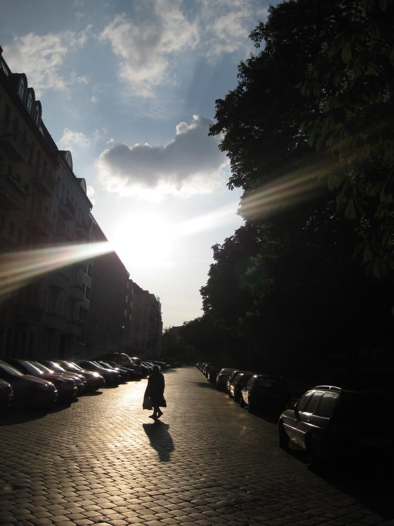
i see her on my way home from school, almost everyday.
sometimes i come home earlier, sometimes later, so i dont see her.
but im pretty sure that i could always catch her if i was in time.
"Where does she go everyday, carrying a heavy bag?"
"To the graveyard." you could guess. Maybe she visits her departed husband....
"To the elderly person meeting/ a coffee party." Maybe she has some cakes for the other seniors in her bag. She must be very lonely, since she goes there everyday.
"Home." She will cook a great meal for her grandchildren with the ingredients she just bought at the supermarket. Isnt she a lovely grandma?
its everyday life because can i see her everyday.
its everyday life because she really does cross this street everyday.
its everyday life because it allows the interpretation of problems/things from everyday life such as
Loss.
Loneliness.
Love.
when i saw that woman again, i thought that would fit the theme so i took the photo spontaneously.
i added a few highlights(sun,street)/lowlights (lady,buildings) for more drama and less details(more interpretation), though.
EDIT:
alright, heres my proof:
http://i854.photobucket.com/albums/ab107/youpassforsure/IMG_0360.jpg
i call it
The old lady
i see her on my way home from school, almost everyday.
sometimes i come home earlier, sometimes later, so i dont see her.
but im pretty sure that i could always catch her if i was in time.
"Where does she go everyday, carrying a heavy bag?"
"To the graveyard." you could guess. Maybe she visits her departed husband....
"To the elderly person meeting/ a coffee party." Maybe she has some cakes for the other seniors in her bag. She must be very lonely, since she goes there everyday.
"Home." She will cook a great meal for her grandchildren with the ingredients she just bought at the supermarket. Isnt she a lovely grandma?
its everyday life because can i see her everyday.
its everyday life because she really does cross this street everyday.
its everyday life because it allows the interpretation of problems/things from everyday life such as
Loss.
Loneliness.
Love.
when i saw that woman again, i thought that would fit the theme so i took the photo spontaneously.
i added a few highlights(sun,street)/lowlights (lady,buildings) for more drama and less details(more interpretation), though.
EDIT:
alright, heres my proof:
http://i854.photobucket.com/albums/ab107/youpassforsure/IMG_0360.jpg
Just write your screen name on a piece of paper and hold it up in front of the camera at this scene =)
Frown
poekmon
I went out to take a photo of the proof. Then I heard thunder nearby. Great. I was gonna stand in the middle of a field. I managed to survive, and here are the photos.
This one focuses on the background: http://img22.imageshack.us/img22/5992/backgroundfocus.jpg
This one focuses on the paper: http://img26.imageshack.us/img26/5226/paperfocus.jpg
And here's a thundercloud to prove my lightning story : http://img194.imageshack.us/img194/5927/thunderc.jpg
This one focuses on the background: http://img22.imageshack.us/img22/5992/backgroundfocus.jpg
This one focuses on the paper: http://img26.imageshack.us/img26/5226/paperfocus.jpg
And here's a thundercloud to prove my lightning story
: http://img194.imageshack.us/img194/5927/thunderc.jpgNeon Ness
Designated Procrastinator
- Joined
- Jul 10, 2008
- Messages
- 3,631

Invisible, 2009
There's a homeless woman that frequents the area near our local Publix shopping center. It gave me the idea of making the homeless as my subject for 'everyday life'... Often times homeless people are avoided or ignored, so I came up with the title 'Invisible'.
Just ordinary graphite for the initial drawing... 4B drawing pencil if it matters. Then I colored/added finishing touches to it in Photoshop.
Progress reports:
First sketch : http://i228.photobucket.com/albums/ee168/BShepard/Invisible-1st-Draft.jpg
Basic colors: http://i228.photobucket.com/albums/ee168/BShepard/Invisible-2nd-Draft.jpg
...*phew*
Glad to see it colored Neon Ness
Nice work to all of you who've submitted so far. There's a scourge of photography over traditional work, but nothing wrong with that. I almost did a piece about an old street woman too, strangely enough. Two's good, but three's [bad] company!
I just made a Paul Rogers and sitcom reference. Man that was cheesy beyond belief.
EDIT: Contest is over as of 23 minutes ago. Good job guys
Elder Sister
Smash Lord
hey neon ness, your first draft was already nice, but the colored one is ....awesome!
youre all so talented..
the next awyp ill try to draw sth...
@spire
just saw yours...im amazed!
oh and thanks cbot
Good luck to all those who entered! I wonder how long it will be before we get teh resultz...
Tentative deadline for judges has been set for Sunday.
This is really a great turnout! I love the variety of pieces everyone's posted. :]
Good luck to everyone! Time to go a-judging....
Good luck to everyone! Time to go a-judging....
Next time guys, when you update with your proof pictures, just edit your entry post and put it there. Makes it nice and organized and easier to view =)
Yeah deadline for us judges is Sunday, so expect results posted Monday/Tuesday.
Yeah deadline for us judges is Sunday, so expect results posted Monday/Tuesday.
Frown
poekmon
So... how's it going?
I have Livvers and TM's scores and am finishing mine up. It's definitely not as long as WWYP so it shouldn't be long. Expect them up before the end of the night.
I only have one more to write up and then compile.
Results! I will beautify over time, so don't worry.
1st: Elder Sister
2nd: Frown
3rd: Neon Ness
I would also like to say that it was a really tight race for 3rd. The difference between 3rd and 6th was 2.5 points. Nevertheless, congratulations to the winners and everyone that entered
Now, the comments. TM didn't do comments for each section because she's Australian and that's ok.
MenoUnderwater
Lythium
Spire III
Frown
Elder Sister
Neon Ness
So yet again, congratulations to all who entered and Elder Sister, Frown, and Neon ness especially. Until next time, remember to ART WITH YOUR POWER!
1st: Elder Sister
2nd: Frown
3rd: Neon Ness
I would also like to say that it was a really tight race for 3rd. The difference between 3rd and 6th was 2.5 points. Nevertheless, congratulations to the winners and everyone that entered
Now, the comments. TM didn't do comments for each section because she's Australian and that's ok.
MenoUnderwater
Virg:
Adherence to Prompt– Definitely something from everyday life.
Skill- Skill is kind of hard to judge here because it is, of course, a photograph. However, the grouping of smaller pictures on the bottom and general organization is very good.
Ingenuity/Style- It was a very creative take. I love the idea of the individual pictures at the bottom. Yes, it does add a little clutter at the bottom and makes it a little chaotic, but still good. You use diagonals of color and lines very well: the general form is very appealing and draws your attention to all parts of the photo.
Aesthetics– The grid at the bottom is a little hard on the eyes. The overabundance of white blends in with part of the main collage and is a little harsh and hard to focus on. I would have loved to see a little more color diversity instead of the numerous varying shades of gray.
Livvers:
Adherence to Prompt:
Did what the prompt asks. Not much to elaborate on =)
Skill:
It can possibly be hard to organize the stuff on the scanner, but it’s still not hard to push a button. I don’t know if you played with the colors, contrast, etc to make a better image, or if you just took what it looked like when scanned.
Ingenuity/Style:
Thought using your scanner was pretty ingenious since you didn’t have a cam. Also, I like the collage of things all put together and weaving throughout.
Aesthetics:
Slightly torn on this one. I think the top is messy, but I love the bottom part with just the squares. It’s clean and controlled. Good composition. The top part dragged your score lower, though.
TM:
Fun concept and I think it stuck to the prompt really well. I think the piece would have been more interesting if you actually took out the top half of the piece and just had the squares instead, it makes a very visually interesting piece that way as well.
Lythium
Virg:
Adherence to Prompt– Being raised in Tennessee I’ve seen my fair share of wild animal interactions and can testify I’ve seen things like this from day to day.
Skill- The general form is good, but you need to work on the smaller definition and shading. The talons of the owl stick out as lacking some depth (as does the mouse) when juxtaposed with the detail you went for in the wings and feathers. With shading, sometimes less is more and I feel on the main wing you got a little carried away (we all do).
Ingenuity/Style– I wish you continued the soft outline of the forms more: there is an awful lot of white space on the canvas that, while allowing the viewer to focus on the two forms, also adds and emptiness to the piece. In terms of the dynamics between the predator and the prey, you captured that very well and made the dive very believable in terms of form.
Aesthetics– The lack of background is what really detracts from the piece. Also, all of the tones are very neutral, which fits the somberness of what is about to happen, but is a little cross with the light blue of the outline.
Livvers:
Adherence to Prompt:
Everyday life in a metaphorical sense
Skill:
Very nice, but lacks some depth. The style of coloring is cool, but I feel they’re just not applied in the right places and makes your bird look a bit odd. Like the brown near the tail feathers; this in conjunction with the placement on the legs doesn’t look correct. Overall the piece looks flat. Also, the blue behind the bird looks too random, like the spot on the right wing(our right).
Ingenuity/Style:
I like your not so literal interpretation of the prompt. I also enjoy the minimalist style of the piece. The colors and the focus on just the two objects.
Aesthetics:
Overall I like looking at is. The simple colors and there being only two objects can draw you in. Also likr the style of the mouse and the owl’s feet.
TM:
I quite liked this in general, I really liked the hints of blue around the edges of the owl and mouse, really brought them out. I think I would have liked to see the texture in the wing on the left, replicated on the left as well for consistency.
Spire III
Virg:
Adherence to Prompt– While it is the everyday life of a man, that man is actually rather unique and rare. I know it was outlined in the thread itself, but can’t completely hold you against it (Livvers ). However, I do have to subtract just a little for the discrepancy.
Skill- You did a very good job on the face reflected in the mirror, but the Klaus sitting in the foreground is a bit off: the head is at the wrong and there are some discrepancies between his neck and collar that aren’t right. When you want to do detail (the face) it looks good, but painting larger, blander areas is actually the weaker point of your skill. Even the back of clothing or the flats of wood drawers have a subtleness to them that gives the scene life. You still need to work a bit on that aspect of your painting.
Ingenuity/Style- The scene of him looking at himself in the mirror is a different look on a typical portrait. There is a giant contrast between the edges of the portrait and his shirt, which is a little trying on the eyes. As much as the edges are dark to show how sad and depressing his actual life is, I think you could have done a little more with it other than just keeping it that dark brown/black neutral space.
Aesthetics- The piece wants to evoke some sadness and sympathy in the man, but it doesn’t completely succeed. I want to look at his face and see some evidence of sadness or wear or remorse, but instead it is perfectly blank like a mannequin with lipstick. Achieving that emotion would add a whole new dynamic to the painting and really help it’s aesthetics.
Livvers:
Adherence to Prompt:
I’d say it doesn’t really reflect Klaus’ everyday life, especially because we don’t know his thoughts or how he was as a person, really. Also, I don’t think this type of reflection on one’s self is an example of everyday life.
Skill:
Very good. Biggest critique I would give is that face in the mirror looks flat. There isn’t much definition. I enjoy the lighting. It looks good on the table, curtain, etc. There is good contrast.
Ingenuity/Style:
Nothing refreshing or new, but you were clever with the prompt. For the style you are going for, you are very good.
Aesthetics:
Pleasing to look at. Nice, dark colors. The piece conveys the feeling you’re going for.
TM:
Very interesting take on the prompt, a bit more abstract than I expected, but I applaud you for going there. I don't think there's much I can tell you really, great sense of light.
Adherence to Prompt– While it is the everyday life of a man, that man is actually rather unique and rare. I know it was outlined in the thread itself, but can’t completely hold you against it (Livvers
). However, I do have to subtract just a little for the discrepancy.Skill- You did a very good job on the face reflected in the mirror, but the Klaus sitting in the foreground is a bit off: the head is at the wrong and there are some discrepancies between his neck and collar that aren’t right. When you want to do detail (the face) it looks good, but painting larger, blander areas is actually the weaker point of your skill. Even the back of clothing or the flats of wood drawers have a subtleness to them that gives the scene life. You still need to work a bit on that aspect of your painting.
Ingenuity/Style- The scene of him looking at himself in the mirror is a different look on a typical portrait. There is a giant contrast between the edges of the portrait and his shirt, which is a little trying on the eyes. As much as the edges are dark to show how sad and depressing his actual life is, I think you could have done a little more with it other than just keeping it that dark brown/black neutral space.
Aesthetics- The piece wants to evoke some sadness and sympathy in the man, but it doesn’t completely succeed. I want to look at his face and see some evidence of sadness or wear or remorse, but instead it is perfectly blank like a mannequin with lipstick. Achieving that emotion would add a whole new dynamic to the painting and really help it’s aesthetics.
Livvers:
Adherence to Prompt:
I’d say it doesn’t really reflect Klaus’ everyday life, especially because we don’t know his thoughts or how he was as a person, really. Also, I don’t think this type of reflection on one’s self is an example of everyday life.
Skill:
Very good. Biggest critique I would give is that face in the mirror looks flat. There isn’t much definition. I enjoy the lighting. It looks good on the table, curtain, etc. There is good contrast.
Ingenuity/Style:
Nothing refreshing or new, but you were clever with the prompt. For the style you are going for, you are very good.
Aesthetics:
Pleasing to look at. Nice, dark colors. The piece conveys the feeling you’re going for.
TM:
Very interesting take on the prompt, a bit more abstract than I expected, but I applaud you for going there. I don't think there's much I can tell you really, great sense of light.
Frown
Virg:
Adherence to Prompt- That is most certainly everyday.
Skill– The fish eye lens effect works very well for this picture. Very good landscape.
Ingenuity/Style- I think this is a very unique take on a landscape. You did well with making the horizon uneven in terms of ground/sky ratio and the ominous overcast with occasional breaking is very nice.
Aesthetics- I really like this piece, I really do. I love the scope and scale of the landscape and the single draw of your little sister in the center. There is a general darkening as you move from right to left over the red building complex and it adds a mood (somewhat hopeful in the end) to the piece. The only things that stick out to me are the poles and trees to the center right and right that break the top of the page and add too much weight. Other than that, very good piece.
Livvers:
Adherence to Prompt:
Did what the prompt asked.
Skill:
It takes LOADS of time and skill to seamlessly put a panorama together. But the lighting and overall picture could be better. Part of me feels you didn’t wait for an optimal day to take this photo, but just decided to take it one day without proper thought to how the picture would turn out.
Ingenuity/Style:
I love that you thought of doing a panorama. Especially considering the amount of effort it takes. But I’m not sure the feel you were going for. The picture looks gloomy and overcast, but the girl in the middle looks happy.
Aesthetics:
Could be a bit more interesting to look at, probably would have helped it the lighting was better, perhaps more things in focus, and if the feel of the background didn’t clash with your sister looking happy. Because of the clash, the amount of grain doesn’t fit.
TM:
I really enjoyed this piece, I know panaroma's can be a pain to put together and think you've done this one remarkably well. Of course would be nicer if the horizon was a bit straighter. The addition of your sister is great though, she provides a great focal point. I would encourage to maybe play a bit with contrast and make the colours a bit deeper and richer. :]
FirustheHedgehogAdherence to Prompt- That is most certainly everyday.
Skill– The fish eye lens effect works very well for this picture. Very good landscape.
Ingenuity/Style- I think this is a very unique take on a landscape. You did well with making the horizon uneven in terms of ground/sky ratio and the ominous overcast with occasional breaking is very nice.
Aesthetics- I really like this piece, I really do. I love the scope and scale of the landscape and the single draw of your little sister in the center. There is a general darkening as you move from right to left over the red building complex and it adds a mood (somewhat hopeful in the end) to the piece. The only things that stick out to me are the poles and trees to the center right and right that break the top of the page and add too much weight. Other than that, very good piece.
Livvers:
Adherence to Prompt:
Did what the prompt asked.
Skill:
It takes LOADS of time and skill to seamlessly put a panorama together. But the lighting and overall picture could be better. Part of me feels you didn’t wait for an optimal day to take this photo, but just decided to take it one day without proper thought to how the picture would turn out.
Ingenuity/Style:
I love that you thought of doing a panorama. Especially considering the amount of effort it takes. But I’m not sure the feel you were going for. The picture looks gloomy and overcast, but the girl in the middle looks happy.
Aesthetics:
Could be a bit more interesting to look at, probably would have helped it the lighting was better, perhaps more things in focus, and if the feel of the background didn’t clash with your sister looking happy. Because of the clash, the amount of grain doesn’t fit.
TM:
I really enjoyed this piece, I know panaroma's can be a pain to put together and think you've done this one remarkably well. Of course would be nicer if the horizon was a bit straighter. The addition of your sister is great though, she provides a great focal point. I would encourage to maybe play a bit with contrast and make the colours a bit deeper and richer. :]
Virg:
Adherence to Prompt- That would be considered everyday.
Skill- While I have to be more lenient on pictures as opposed to physical art, the actual scene itself isn’t doesn’t have the same skillful essence as some of the other pieces. The shoe is on white paper somewhat thrown together on the carpet. It just doesn’t feel like there was significant work put into thinking of the shot.
Ingenuity/Style- Most of the scars and beatings you are trying to show on the shoe are hidden in the shade of both the shoe itself and the angle of the camera. The contrast of the white background (the papers and carpet) needs to be more uniform in order to really push your attention to the shoe: the grays and browns of the lines and cloth just add a dull thud away from the focus.
Aesthetics- The piece suffers from haste. Next time, take a lot of pictures and really sit down and focus on what angles and lighting best highlight what you are trying to show the audience. The piece wants to reach out and grab your attention, but with the 3/4ths angle and the shade covering it it slowly sulks into the background.
Livvers:
Adherence to prompt:
Did exactly what prompt said.
Skill:
Well it’s fuzzy, lighting isn’t great. Doesn’t look like much time or effort was put into this shot. You can see the carpet.
Ingenuity/Style:
I liked your description on how it shows what the wearer went through and also how it’s wear and tear shows that the wearer has indeed worn that show for a very long time. I feel you could have had an interesting style going, but it feels like you kinda tossed things all together. Also, while both your subjects(the shoe and the paper)are along the lines of the prompt, they don’t fit together.
Aesthetics:
Again, fuzzy. Nothing really draws your eye to the picture. No real good balance of color, and the papers just look messy.
TM:
I like your idea behind your concept, although I think it could've been executed a little bit better. I'm not sure if you wanted to show the carpet really or not, but I think it would've looked sharper if you covered it up completely. Be conscious of lighting when you're taking photos, because it's kinda dark, your photo's come out a bit blurry. You may have been better off being on the other side of your shoe when taking the photo, since that's where the light source is coming from.
I think it may have been interesting if you did close up shots of each different aspect of the shoe, at interesting angles, as you have detailed in your description and then tiled them next to each other, sort of like what MenoUnderwater has done. Your piece would speak far more for itself then. :]
Elder Sister
Virg:
Adherence to Prompt– That is everyday, all right.
Skill- The shot itself is well done. The buildings and trees keep the focus on the woman and all fo the diagonals (save the sun) pull you into the photo. Well done.
Ingenuity/Style- The dark/light contrast in the piece is very good: the woman and the street, the alley and the sky. However, the tones are overly gray and dull and somewhat overpower the light, adding a dullness to the scene. This someone goes against the brightness of the sun and feel of warmth and summer from the sky and adds a little confusion to the piece.
Aesthetics- Overall, the piece is strong: it is a nice mirrored scene with a main focus that properly draws attention to it. Some of the details on the buildings and cars stand out a bit too much and lure you to the more dull part of the picture, but it is a minor thing. I just wish the dark wasn’t so overbearing on an otherwise happy piece.
Livvers:
Adherence to Prompt:
Did what the prompt said =)
Skill:
Very nice! Colors are overall great, but I feel that maybe a bit of experienced tweaking in Photoshop could’ve enhanced the picture. Regardless everything works well together and it seems like you really cared about getting this shot at the right time of day AND while the woman was walking. Good stuff.
Ingenuity/Style:
I love the light and the idea of taking the shot at this particular time. I enjoy that you took how someone else’s everyday life meshes into your’s, possibly with out that other person realizing it.
Aesthetics:
Very eye catching. The light flare is beautiful along with the sky, and I love the woman’s sillouette and shadow. I also think the composition is very nice.
TM:
Gorgeous, I really enjoy looking at this piece. Fantastic lighting and composition, I love the silhouette of the old lady.
Neon Ness
Virg:
Adherence to Prompt– I used to see homeless people all the time.
Skill- The form is a little rough (her right hip looks disjointed) but decent none the less. However, you need to work on your shading. In ragged clothing, there are huge streaks and folds of fabric that throw shadows deep into the heart of the form. Be daring with shading: don’t just use a darker shade of gray or fabric to shade. In blacks there are blues. In greens there are yellows.
Ingenuity/Style- It is a basic portrait with the subject squarely in the center of the page. While we do see what you want us to see, its casualness doesn’t pull us in. Her legs are almost completely horizontal and create a little space between the border and her that stops your eyes from wandering (the garbage can also closes in the borders). The woman is supposed to be this ignored refuse of society, but she looks clean, rigid and somewhat peaceful.
Aesthetics- The white border of the piece is somewhat distracting. You could do a lot with it or refocus the piece to cut it out. Otherwise, it doesn’t really do anything and detracts from the painting. Overall, it’s decent, but still needs a lot of technical work to fully bring it off the paper and into the viewers mind.
Livvers:
Adherence to Prompt:
Did what was said. I enjoyed how you picked the homeless.
Skill:
The lighting on the wall doesn’t make sense to me. It also causes the homeless person’s pose to look awkward, as it doesn’t look like she’s leaning against the wall. Anatomy is a bit off but overall it looks very good. I love the coloring. The tones work very nicely together. One thing you need to work on is shading and shadows. There is no shading that is dark here. No deep, defining shadows showing she’s on the ground. Also, the lightening you chose doesn’t seem to fit the feel of someone who is homeless and often overlooked or not cared about.
Ingenuity/Style:
I like how you targeted the homeless. How their everyday life is often not cared about to many people. I also think your style is quite nice and blends well together.
Aesthetics:
Very pleasing to look at. It’s soft tones are a bit too inviting, though, considering the subject matter.
TM:
I love the lil smiley badge on her hat! Nice colouring, I like the colour palette, although I think you could've gone a bit darker with some of the shadows to vary up the tone values. The arm closest to us is also looking a bit tooo long, but you have put her in a bit of a tough pose, so I think you've done a good job overall.
And that's the very first AWYP! I hope you guys enjoyed entering, because that's what the contest is really about: making artwork and getting better. The winners should get their prizes shortly (we have to talk with the MLG guys to upload the new icon) but it shouldn't take too long.Adherence to Prompt– I used to see homeless people all the time.
Skill- The form is a little rough (her right hip looks disjointed) but decent none the less. However, you need to work on your shading. In ragged clothing, there are huge streaks and folds of fabric that throw shadows deep into the heart of the form. Be daring with shading: don’t just use a darker shade of gray or fabric to shade. In blacks there are blues. In greens there are yellows.
Ingenuity/Style- It is a basic portrait with the subject squarely in the center of the page. While we do see what you want us to see, its casualness doesn’t pull us in. Her legs are almost completely horizontal and create a little space between the border and her that stops your eyes from wandering (the garbage can also closes in the borders). The woman is supposed to be this ignored refuse of society, but she looks clean, rigid and somewhat peaceful.
Aesthetics- The white border of the piece is somewhat distracting. You could do a lot with it or refocus the piece to cut it out. Otherwise, it doesn’t really do anything and detracts from the painting. Overall, it’s decent, but still needs a lot of technical work to fully bring it off the paper and into the viewers mind.
Livvers:
Adherence to Prompt:
Did what was said. I enjoyed how you picked the homeless.
Skill:
The lighting on the wall doesn’t make sense to me. It also causes the homeless person’s pose to look awkward, as it doesn’t look like she’s leaning against the wall. Anatomy is a bit off but overall it looks very good. I love the coloring. The tones work very nicely together. One thing you need to work on is shading and shadows. There is no shading that is dark here. No deep, defining shadows showing she’s on the ground. Also, the lightening you chose doesn’t seem to fit the feel of someone who is homeless and often overlooked or not cared about.
Ingenuity/Style:
I like how you targeted the homeless. How their everyday life is often not cared about to many people. I also think your style is quite nice and blends well together.
Aesthetics:
Very pleasing to look at. It’s soft tones are a bit too inviting, though, considering the subject matter.
TM:
I love the lil smiley badge on her hat! Nice colouring, I like the colour palette, although I think you could've gone a bit darker with some of the shadows to vary up the tone values. The arm closest to us is also looking a bit tooo long, but you have put her in a bit of a tough pose, so I think you've done a good job overall.
So yet again, congratulations to all who entered and Elder Sister, Frown, and Neon ness especially. Until next time, remember to ART WITH YOUR POWER!
M.K
Level 55
Congratulations to all those who entered, especially to those of you who have placed! You truly deserve it as your pieces truly shined over the rest!
^-^
^-^
PMKNG
Smash Ace
Congrats to everyone :D Too lazy to read every little point, but I will tomorrow.
SkylerOcon
Tiny Dancer
I have my disagreements with the results. Particularily Neon Ness' piece placing and Spire's piece not placing (no offense to Neon Ness). All the pieces entered were great, but Spire not placing was just kidna... WTF worthy.
Zero Beat
Cognitive Scientist
Congratulations everyone.
Still I must say, your painting blew me away Spire, perhaps next time.
. Still I must say, your painting blew me away Spire, perhaps next time
.That's enough out of both of you. If people who were in no way part of the contest have a problem with the judging, I believe privately messaging the judges would fall under the category of respectful behavior.
Congratulations to everyone who participated.
Congratulations to everyone who participated.
M.K
Level 55
Agreed! I'd like to give it a shot as well!Congrats everyone!
When will the next prompt be up? I think I will have time for the next one
I think that the judges did a very good job of giving helpful critique to each of the members that participate. Judges, you did a great job, thank you =D.
Although I wasn't really posting in here, I was keeping up with the results. I can't wait to take part in the next AWYP!
I look forward to actually submitting something next contest. =D
As far as the results go, I'm not going to get down to the nitty-gritty (y'know, because of Tom's post), but I guess all I can say is that I'm a bit surprised. Not disappointed, but surprised.
Congrats, everyone.
As far as the results go, I'm not going to get down to the nitty-gritty (y'know, because of Tom's post), but I guess all I can say is that I'm a bit surprised. Not disappointed, but surprised.
Congrats, everyone.
Frown
poekmon
OH MY
Second place! That's fantastic!
Second place! That's fantastic!
I don't know if that was directed at me or not. But sorry, if it was.That's enough out of both of you. If people who were in no way part of the contest have a problem with the judging, I believe privately messaging the judges would fall under the category of respectful behavior.
Congratulations to everyone who participated.
Anyways, when's the next one going to be up? I should actually have time to finish this time.
It still needs to be discussed. I personally would like the next one to start soon, but I'll be busy until Saturday so I won't have much time to put thought into it or discuss it with a clear mind.
Elder Sister
Smash Lord
im looking forward to the next AWYP^^
Great job everyone, and congratulations to the winners!
So when can we look forward to the next one?
So when can we look forward to the next one?
Elder Sister
Smash Lord
Any prompt ideas in mind, Elder Sister?
 nahh i havnt really realized it yet....
*waits for saturday to come*