Not looking too bad, I started with doing a lot of nature stuff as well. So here are my comments, I hope they help you out : )
First pic - overall good, I like the colours and post processing you've done, good composition.
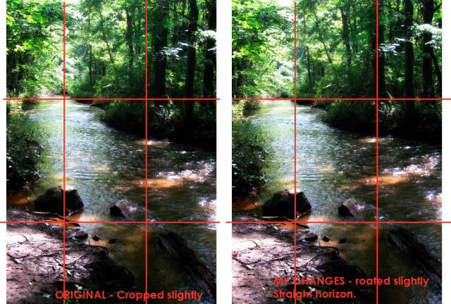
Second pic - Probably my favourite out of the lot you've put up, would just be good to straighten up your horizon....I've made an example here...
You may think I'm being super anal here, but it's little things like this I tend to notice, I find the flow and overall feel works better. It's been cropped slightly as well. The top left intersection of lines will show you the the way I've rotated it to straighten the horizon.
But otherwise, really nice, good contrast and exposure levels, the dark areas aren't totaly black and the white areas aren't completely blown out either. Really nice and crisp too. :]
Picture 3 - where is your focal point? I don't feel you have put much thought into composition in this so as a result is a big lacking and doesn't hold my interest for long, my eyes wander over it without really looking at anything. Also a tad over-saturated, it is obvious and it doesn't look very natural nor pleasant.
Picture 4 - nice subject, again I feel there is a lack of composition here, the mini waterfall is in the centre of your image, which is generally a no no when it comes to composition unless you have a very symmetrical image. Whilst I don't believe you should live by the rule of thirds, it's a good basic way to start out and understanding what makes an image look good, it's something that should eventually become intuitive rather than measured.
Picture 5 - I think this could have been an excellent image, but the blur doesn't help it unfortunately! It doesn't really add anything artistic to it either, so whilst I'm not against blur, it needs to be used in the appropriate places.
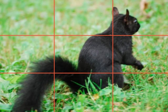
Picture 6 - I know animals can be difficult, but the blur really detracts from this, composition could also be improved...see here....
The top right intersection is sort of at the squirrel's neck, instead of the head or eyes where it would make more sense as a focal point. The problem with having it at the neck, is that the tail at the bottom of the image is also at another third intersection, so my line of sight travels down the neck, over the body and neck instead of up at the head.
Yeah. I hope that all makes sense, I haven't critiqued anyone for a while, you should try to work on your composition a bit, which really should come as an intuitive thing. You can ask my friends when I'm out and about taking pictures, I compose the picture about as fast as I take the picture and not a lot of people notice me doing it! Study the rule of thirds a bit or even better, the golden rule/spiral, which will help put better focus and flow into your pictures.
And two lil quotes from Henri Cartier Bresson, one of the fathers of the type of photography we see today that I think are quite relevant...
"One does not add composition as though as it were an afterthought superimposed on the basic subject material......."
"But he composes a picture in very nearly the same amount of time it takes to click the shutter, at the speed of a reflex action. "


 .
.
")