BlackKnight23
Smash Apprentice
sorry moving post

Welcome to Smashboards, the world's largest Super Smash Brothers community! Over 250,000 Smash Bros. fans from around the world have come to discuss these great games in over 19 million posts!
You are currently viewing our boards as a visitor. Click here to sign up right now and start on your path in the Smash community!
O my bad lol sorryWelcome! Sigs actually go here though:
http://www.smashboards.com/showthread.php?t=235708
And comment on someone else's work before you ask for feedback. Thanks.
So if you're going to be including things like genitalia, then I'm gonna have to say no dice.Kirby King said:Q: I want to show off my collection of fresh adult artwork. Can I post them here?
A: A firm no - you may not post explicit material. If you are not sure if your artwork is appropriate, check with a moderator before posting it.
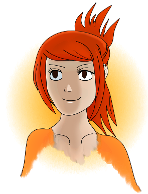
Might I suggest light shading with a blue tint, I think it would work nicely with your background. And some highlights lit from behind too.
Just a little person I made from scratch using inkscape. I wish I had a scanner so then I could just trace then color. If anyone has any tips on lighting they would like to share it would be appreciated.


I love the way you make your lines, it's very fluid. I'm assuming you don't have the pen tool in PSP or SAI. If not, then you may have to work with the lasso tool. Time consuming, yes. But it's well worth it. Use vibrant colors to make it pop =DMight I suggest light shading with a blue tint, I think it would work nicely with your background. And some highlights lit from behind too.
Here's something I was working on In PSP and SAI
Can somebody suggest a way to ink this? Cause my lasso method just takes way too long.

") There's a lot of negative space so I assume you were planning on adding shoulders/torso at least. There was someone who used to post here named HybridTheory, you guys have similar styles. Can't wait to see more of your work.
There's a lot of negative space so I assume you were planning on adding shoulders/torso at least. There was someone who used to post here named HybridTheory, you guys have similar styles. Can't wait to see more of your work.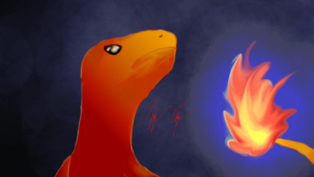


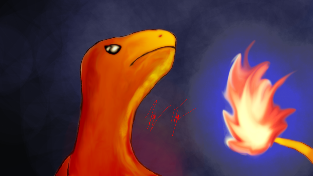
@Charmander - it feels like you don't know the form of what you are drawing. Sure, the light looks like it's coming from the right, but it also makes it feel like charmander is completely flat. I also feel like yiou should be outlining him differently - with more solid, single lines instead of the sketchy look you have about him.
Best part of the image was the fire.
@Santo - those images are amazing. Like . . . sell them or something. Awe striking.

 His torso/left arm should cast a shadow on the rope cable behind him.


Here's mine: (I made it blue... because I can and I like blue.)


Good work, but watch your form. He looks like he has 3 joints in his arm.
Here's mine: (I made it blue... because I can and I like blue.)
@Zephron: Very nice stuff, especially liking the texture work, how long have you been 3d'ing
Oh! My bad, but I looks good enough to be 3d from here!
yeah, i did reuse it, lol; i am really lazy... at the arm thing, the shading, i dropped the ball on that.@augustoflores
First of all, I really like the art piece. It's clean, and very nice looking.
On his chest, shoulders, and helmet I noticed you use the same sort of shape to show shine.
Unless it's some sort of insignia I don't know about.
It doesnt really work for anything other than his helmet IMO. Try using a similar, but different shape to do that.
His arms also need to better shading work. His right arm appears to have a cylindrical thing on it, but it has almost no shading on it at all. His left arm also has parts underneath the hand guard thing that needs to be shaded as well.
However, these are very small in the end of things, you made a great piece of art
The arm looks fine now. Your lighting is consistent except for that one thing.