Thanks ^3^:D
Looks nice!
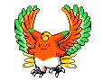
@Snucas: Sorry, but removing Manaphy's cords makes it too Rotomish. You want to try to balance out the features of two Pogeymonz when you do a fusion.

Welcome to Smashboards, the world's largest Super Smash Brothers community! Over 250,000 Smash Bros. fans from around the world have come to discuss these great games in over 19 million posts!
You are currently viewing our boards as a visitor. Click here to sign up right now and start on your path in the Smash community!
Thanks ^3^:D
Looks nice!
I think this is the best sprite out of all the forms you have tried. The spike is alright, and the coloring/fusion is fairly good!The one without the mouth seems fair. Machamp's mouth on Hypno's head seems awkward.

"Manatom"
CnC?


Wow! Holy crap, Dedede, these are amazing! You did such a great job! It's such a good alternative to my line since I used the Budew line as the base!I like the first one.
Shidew, Luxselia, and Luxerade!
Since the request was finished in the CPS, I figured I would post this. I've already posted the last one, but I'll just add it because it finishes the evolution line. CnC is much appreciated.
That's pretty good, DeDeDe. As Meta-Kirby said, it is a VERY good alternative to his.I like the first one.
Shidew, Luxselia, and Luxerade!
Since the request was finished in the CPS, I figured I would post this. I've already posted the last one, but I'll just add it because it finishes the evolution line. CnC is much appreciated.


It's not too bad. Never use JPG.I tried my hand at a sprite. Wow I'm bad.


Lol. That's an awesome way to remember.But always remember PwNaGe.
I like them a lot. One thing I would change, though, would be the outline on the Guardsicle. It looks too mashed in, like it is trying to fit in a box or something. And for monstorm, maybe you could change the shading and the outline color. Also, add some more details to it, because right now, it kind of looks like a flat piece of blank cloud-shaped paper with minimal shading.They're a bit simple, and Monstorm's hands are a little off, but otherwise I like 'em.
Cool, except for what Firus and SpelignFial pointed out.I tried my hand at a sprite. Wow I'm bad.
I finally made my first completely scratched Pokemon!
Monstorm
Water/Electric
Guardsicle
Ice
They're a bit simple, and Monstorm's hands are a little off, but otherwise I like 'em.
kool. I don't even want to try doing that until I get splicing down.I finally made my first completely scratched Pokemon!
Monstorm
Water/Electric
Guardsicle
Ice
They're a bit simple, and Monstorm's hands are a little off, but otherwise I like 'em.


Awww, this one is adorable! The only thing I'd suggest to change is the ear color- it looks a bit weird being blue, while the rest of his body is white. It's a great fusion, though.sorry, excuse my double post, but we need more people critiquing. besides, this is the Poke Center.
here's a new one: Azurisu


That thing looks awesome.Anyways I haven't done any sprites in a while, so I decided to take up the challenge of a Dunsparce/Charizard fusion.
I also made one with fangs and the Dunsparce back-stripe pattern on his belly.
Any critique?


I think you should have kept the spiral the way it was. The positioning of the roses needs help too. I like the top of him, but the legs should be a bit darker imo.Bumped and...

another sprite I made.


Haha thanks, after looking at it for awhile, it does look kinda bland. The only thing wrong with your sprite is that the edges are a bit to straight, and it's missing some shading. Oh well, it's cute! =DHaha, that's awesome. It looks good, but maybe you could try changing the colour a little to see if you can get something more interesting. Not that you have to, because I personally think it looks fine. It's so cute.
Compare that to my first scratch sprite.
v
I of course changed it once I realized how awful it looked, but I have to say that yours is great for a first time scratch sprite. Go ahead and critique it if you like.

I changed the spiral color to make it match Roselia's mouth color. The red rose was the awkward part so I had to scratch it onto the arm. And I made the legs a light color to match Roselia's legs.I think you should have kept the spiral the way it was. The positioning of the roses needs help too. I like the top of him, but the legs should be a bit darker imo.
Wow... these rock. I have no sprites but I just had to give you props. *Claps for 2 minutes* Good job.Giant Sprite Dump comin up!


So consider these my beginner ones. I wanna start some hard stuff now. Really wanna pull off some obscure ones.

