
-
Welcome to Smashboards, the world's largest Super Smash Brothers community! Over 250,000 Smash Bros. fans from around the world have come to discuss these great games in over 19 million posts!
You are currently viewing our boards as a visitor. Click here to sign up right now and start on your path in the Smash community!
It appears that you are using ad block :'(
Hey, we get it. However this website is run by and for the community... and it needs ads in order to keep running.
Please disable your adblock on Smashboards, or go premium to hide all advertisements and this notice.
Alternatively, this ad may have just failed to load. Woops!
Please disable your adblock on Smashboards, or go premium to hide all advertisements and this notice.
Alternatively, this ad may have just failed to load. Woops!
Project M Social Thread
- Thread starter Project M
- Start date
- Status
- Not open for further replies.
JCaesar
Smash Hero
The one I posted was actually made by Mookie as well. In case you didn't notice, it's the one used in the intro movie/screen in the demo. I really like the font style on that one.I like that one^^
plus mookies an OG.
edit: I ment Mookies not Jcaesars.
For reference, it just got reposted
VVV
[TSON]
Hella.
gonna have to say this one wins.
Bam.
Slashy
Smash Lord
The first one Mookie made has lots of style and is functional, it tries to captivate you whilst being easy to read.
Makai
Smash Apprentice
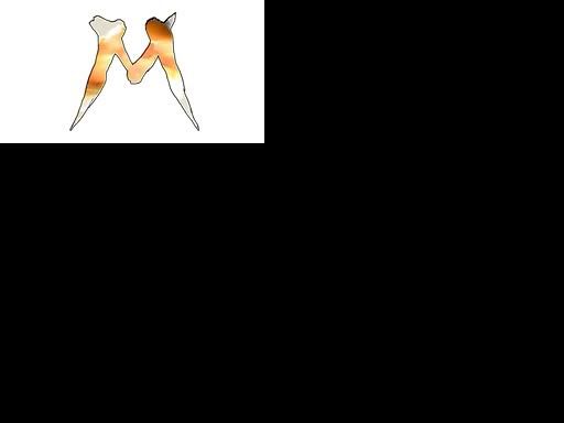
The M's in the current and Jcaesar's suggestion look pretty bad to me. The legs shouldn't swoop out like that. It's really obvious that it's the checkmark from Brawl's logo and it just doesn't look very good to me.
Machiavelli.CF
Ivy of the West
- Joined
- Apr 24, 2008
- Messages
- 757
- Location
- Orange County, CA
- NNID
- Machiavelli.CF
- 3DS FC
- 3222-5675-4966
All the small white outlines are annoying to even look at. With all my years of Graphic Desing experience I've always hated outlines that were really thin, in far too much contrast to the colors around it, or strange white shadows. Its just hard for me to look at e.e a simple solid outline would be so much better on them all.
Slashy
Smash Lord
You and evilagram should both create an entirely new logo, since you're both graphic designers.All the small white outlines are annoying to even look at. With all my years of Graphic Desing experience I've always hated outlines that were really thin, in far too much contrast to the colors around it, or strange white shadows. Its just hard for me to look at e.e a simple solid outline would be so much better on them all.
Evilagram
Smash Journeyman
- Joined
- Oct 4, 2007
- Messages
- 420
That's what pissed me off, using multiple strokes for 1 letter that has no intersections. It's just bad typography. The logo in the OP looks like a disaster.The M's in the current and Jcaesar's suggestion look pretty bad to me. The legs shouldn't swoop out like that. It's really obvious that it's the checkmark from Brawl's logo and it just doesn't look very good to me.
Makai
Smash Apprentice
That and the text letters are not level AT ALL. I don't mean to bash the creator of the original, but that one by Mookie looks really really professional in comparison.That's what pissed me off, using multiple strokes for 1 letter that has no intersections. It's just bad typography. The logo in the OP looks like a disaster.
Slashy
Smash Lord
Maybe release the final game with themes?It would be nice to see a few of these new ones edited onto the intro screen. A lot of them look good, but I'd like to see them in game to see how they mesh with the background.
Brawl Theme
Melee Theme
C. Falcon Theme?
That's what Linux distros do with their desktop environments.
ClinkStryphart
Smash Journeyman
I don't think so and man its been a while since I've been to the forums this new layout is pretty nice I do admit. (sigh work).
But anywho in regards to the LD stuff I'm glad its fixed due to that way things will be proper. The one thing I do know is that now that is out of the way theres a ton of more hidden things they can work on as well as possibly the characters. Since it seemed like LD took the most amount of time to figure out how to fix.
I'm gonna try to get Link animation working again for the entrance for him. But I cannot guarntee anything. I still have my worked saved.
The sign I think looks cool as it is since its original. Have you guys tried taking the faces of the characters and filling the M that way? Or possibly screen caputering them in a pose of each character to fill in the M. Regardless either I think would be cool.
[TSON]
Hella.
just went back and actually looked deeply at the logo i just quoted >_>
i'm going to have to say it needs a touchup.
the top of the M is clipped and the strokes are twosided. which makes no sense.
other than that it is still my favorite though.
i'm going to have to say it needs a touchup.
the top of the M is clipped and the strokes are twosided. which makes no sense.
other than that it is still my favorite though.
Evilagram
Smash Journeyman
- Joined
- Oct 4, 2007
- Messages
- 420
The text on mine doesn't work without the white outline, I threw in the white on the M at the last minute, here it is without the white:All the small white outlines are annoying to even look at. With all my years of Graphic Desing experience I've always hated outlines that were really thin, in far too much contrast to the colors around it, or strange white shadows. Its just hard for me to look at e.e a simple solid outline would be so much better on them all.

Machiavelli.CF
Ivy of the West
- Joined
- Apr 24, 2008
- Messages
- 757
- Location
- Orange County, CA
- NNID
- Machiavelli.CF
- 3DS FC
- 3222-5675-4966
I would but:You and evilagram should both create an entirely new logo, since you're both graphic designers.
1: I'm content with the current logo, I wouldnt change anything but the brush stroke inconsistencies.
2: It probably wouldnt be used by the br anyhow.
Edit: I like the change you made, Im curious how a [2nd (thicker)] black outline would look encasing the white one.
Makai
Smash Apprentice
That one looks really arabic, evilagram. It just doesn't fit nearly as well as

Slashy
Smash Lord
It's style my friend.That one looks really arabic, evilagram. It just doesn't fit nearly as well as
Evilagram
Smash Journeyman
- Joined
- Oct 4, 2007
- Messages
- 420
It was drawn from scratch in a combination of flash and photoshop to match the original brawl font.
Hi-res version here: http://dl.dropbox.com/u/416986/Pictures/ProjMlogoComposite.png
Hi-res version here: http://dl.dropbox.com/u/416986/Pictures/ProjMlogoComposite.png
Machiavelli.CF
Ivy of the West
- Joined
- Apr 24, 2008
- Messages
- 757
- Location
- Orange County, CA
- NNID
- Machiavelli.CF
- 3DS FC
- 3222-5675-4966
What program did you put it all togeather in? Illustrator?
Evilagram
Smash Journeyman
- Joined
- Oct 4, 2007
- Messages
- 420
>last postPart of the reason that I like the current one is that it looks hand-drawn. Like its been inked or something. Reminds me of something I'd see in a comic-book.
>mention how mine was hand drawn
oh come on.
Slashy
Smash Lord
The letters look like a poorly done version of Brawl's font. I think the original M and evilagram's "PROJECT" would look awesome.Part of the reason that I like the current one is that it looks hand-drawn. Like its been inked or something. Reminds me of something I'd see in a comic-book.
I just think that evilagram's letters are superior to the original team's one for that reason.
Evilagram
Smash Journeyman
- Joined
- Oct 4, 2007
- Messages
- 420
Photoshop. Couldn't do the color effects anywhere else.What program did you put it all togeather in? Illustrator?
Hey, you only posted that, what, a minute before mine? I was still writing my post out.>last post
>mention how mine was hand drawn
oh come on.
Not trying to attack anyone's work here.
JCaesar
Smash Hero
I kind of agree, the M in that one could use some work. But I definitely think that the dark, future-y "Project" and the overall layout of that one look the best. And best of all, it looks nothing like the Brawl fontjust went back and actually looked deeply at the logo i just quoted >_>
i'm going to have to say it needs a touchup.
the top of the M is clipped and the strokes are twosided. which makes no sense.
other than that it is still my favorite though.


MK26
Smash Master
off topic
live topic is so fun to watch
on topic
no preference for logo
live topic is so fun to watch
on topic
no preference for logo
Evilagram
Smash Journeyman
- Joined
- Oct 4, 2007
- Messages
- 420
Nah, the "project" part is a stock font, screw those.I kind of agree, the M in that one could use some work. But I definitely think that the dark, future-y "Project" and the overall layout of that one look the best. And best of all, it looks nothing like the Brawl font
Slashy
Smash Lord
Don't bash Brawl's aesthetics just because it has bad gameplay

Arguably Brawl's font closer mimics the insanity this game is supposed to have, this logo above wouldn't be nearly as interesting if it tried to look "ominous" and "futuristic".
Arguably Brawl's font closer mimics the insanity this game is supposed to have, this logo above wouldn't be nearly as interesting if it tried to look "ominous" and "futuristic".
ClinkStryphart
Smash Journeyman
Well if you put the one Makai put up and Invert its colors in MS Paint it looks pretty damn awesome. Just would have to outline the M again I think.
Slashy
Smash Lord
I'd like to point out that saying that anything from Brawl is automatically bad is absurd.
Project:M is a video game, where trophies come to life and a giant monkey and an electric rat can fight on a Pirate Ship.
Nothing about Project:M needs to be serious, just because Melee with its aesthetics doesn't mean that Brawl or Smash 64 are bad since they try to be crazy and creative. Don't lose sight because after all the numerical values, coding, balance changes, and controller modifications that this is will be far more meaningful than a game where a giant gorrilla fights an electric rat.
Just for reference, that wasn't what I meant. I meant the original looked as if it was hand-drawn on paper, then scanned onto the computer to be touched up in something like photoshop. I wasn't implying you hadn't drawn anything.It was drawn from scratch in a combination of flash and photoshop to match the original brawl font.
Hi-res version here: http://dl.dropbox.com/u/416986/Pictures/ProjMlogoComposite.png
Also, I wouldn't be opposed to editing the strokes a bit in the original title, so long as the rest of it stayed the same.
No. It should be called M.E.L.E.EI never really thought about it but, will project m always be called "Project M" even after it's released? that'd be kinda strange.
Personally, I think it should be called Melee: Second Impact!
Okay not really but you get my point.
And Jcz, I think the font should be a bit bigger on that one.
Edit: Partially ninja'd by soth lol
Men
Emulate
Long-lasting
Extrodinary
Euporhia
standardtoaster
Tubacabra
Okay...I have no idea how that discussion on logos started up, but the stream should be starting up in a few minutes. To tide you over until then, on request of PeachEater74, a gif of ganon landing on DL64 plat.

[ 8:12 pm] Pyrax lol at the tree blinking thinking what the **** just happened
[ 8:12 pm] Pyrax lol at the tree blinking thinking what the **** just happened
ruhtraeel
Smash Ace
Is LD still stuckOkay...I have no idea how that discussion on logos started up, but the stream should be starting up in a few minutes. To tide you over until then, on request of PeachEater74, a gif of ganon landing on DL64 plat.
standardtoaster
Tubacabra
Ruhtraeel, what? Landing detection has been fixed almost entirely.
MK26
Smash Master
spam this in the melee boards?Okay...I have no idea how that discussion on logos started up, but the stream should be starting up in a few minutes. To tide you over until then, on request of PeachEater74, a gif of ganon landing on DL64 plat.
[ 8:12 pm] Pyrax lol at the tree blinking thinking what the **** just happened
ruhtraeel
Smash Ace
I see. Hopefully P:M is starting to resemble Melee now.Ruhtraeel, what? Landing detection has been fixed almost entirely.

- Status
- Not open for further replies.