• Welcome to Smashboards, the world's largest Super Smash Brothers community! Over 250,000 Smash Bros. fans from around the world have come to discuss these great games in over 19 million posts!

    You are currently viewing our boards as a visitor. Click here to sign up right now and start on your path in the Smash community!

The Sig Critique Topic

Status
Not open for further replies.

Neon Ness

Designated Procrastinator
Joined
Jul 10, 2008
Messages
3,631
@ ZIO:

Well the text draggs the attention away from the pic since your flooding it with text lol. I would try to minimize it make it more direct to get your point across while showing off the focal point.
Thisthisthis

From a design perspective I would just say keep it simpler. You got like 3 different fonts, bolded outlines on letters, and 6 different pictures of the same person making up the background, plus a sort of odd frosty border.

You probably want to choose 1 main font, nothing fancy, and maybe just have 'Fusion Comic' in one of the corners, with 'click' smaller under that. And just one picture of her is fine. Maybe the black/white one since it's more ambiguous-- you wanna pique people's curiosity after all. I'll come up with some designs for one this week too.

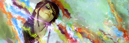
@ BlackKnight: 1st one has awesome colors. The greenish yellow and orange bursts look nice near the middle, more color bursts like that would look great. I would just say lower the brightness on the guy. His highlights are almost stark white :laugh: It might be better off toned down somewhat.

I think I'll work on a new sig this week. :bee:
 

ZIO

( ͡° ͜ʖ ͡°)
Joined
Sep 14, 2006
Messages
10,884
Location
FREEDOM
Just saying FUSION COMIC really doesn't get the message across. But if you think it should be better, I suppose I'll remove the attention getter.
 

Neon Ness

Designated Procrastinator
Joined
Jul 10, 2008
Messages
3,631
Yeah... I guess it depends on what you want. If you want something straightforward go for it.

I was thinking more like "How will this make people curious enough to actually want to click on this?"
 

ZIO

( ͡° ͜ʖ ͡°)
Joined
Sep 14, 2006
Messages
10,884
Location
FREEDOM
Just saying FUSION COMIC doesn't say "You can be the next artist" so I threw in that sentence.

But, I think having the multiple drawing can help get that message across, so I'm gonna probably keep that in.


BlackKnight23

Smash Apprentice
Joined
Jun 24, 2006
Messages
160
Location
Somewhere in texas
Just saying FUSION COMIC doesn't say "You can be the next artist" so I threw in that sentence.

But, I think having the multiple drawing can help get that message across, so I'm gonna probably keep that in.


Thats a bit better cause now you can see the pics. versus trying to decipher through the clutter

and thank you neon I will make sure to consider that next time I make on like it
 

Neon Ness

Designated Procrastinator
Joined
Jul 10, 2008
Messages
3,631
Amazing stuff, really. The lighting is incredible in both of those @.@

I like the colors more in the first tag. Are those mostly C4Ds for the bg? Really nice.
 

KoSa!

Smash Journeyman
Joined
Oct 2, 2008
Messages
481
Location
NJ
That dmc tag is sweet, wish I could do that stuff.:ohwell:

I did this in a couple hours on and off, with my computer turning off every thirty minutes. It's a pain when you don't save frequently and have to start over.:mad:


CnC
 

Evil-Guy

Smash Journeyman
Joined
Mar 2, 2009
Messages
416
Location
Cats Eye Nebula Constellation: Draco
That dmc tag is sweet, wish I could do that stuff.:ohwell:

I did this in a couple hours on and off, with my computer turning off every thirty minutes. It's a pain when you don't save frequently and have to start over.:mad:


CnC

You kinda dont wanna center a focal, its a bad bad bad thing, its makes your composition look boring, and stuff.

Also you kinda dont wanna use that gradient map, because it makes your work look similar of those low level artists you find. The background is loq quality too. Use the blur tool on a low opacity and go around the edges that make it sharp. Nice tag :)


cnc please! :) those are old btw
 

Neon Ness

Designated Procrastinator
Joined
Jul 10, 2008
Messages
3,631
Very funny.

This thread is actually for gfx sigs though, like the ones posted above and on every other page :laugh:

@ Evil-Guy: Man if those are old, your newer ones must be incredible...

2nd has really nice colors. Somehow I'm not really getting a great sense of depth I'd expect from such a wide space though. Maybe something to fixed by blurring some areas of the bg or foreground?

Lighting looks great. I'm liking the overall layout and point of view. It's really good, but it doesn't quite have that "WOW!" factor for me yet.

@ KoSa!: Yeah, Rule of Thirds generally makes for a better layout (not always). So try to have her slightly left probably. The colors could have been good, I just think they need more subtelty. Right now they're really saturated and 'in your face'. The background doesn't really have a deliberate direction as far as I can tell either. A standard way of creating some flow is using the smudge tool to smudge a duplicated layer of your main render in some outward direction. Right now she's just sort of plopped onto the background.

But yeah, nothing you can do about your computer shutting off. :( A valiant effort. Definitely look through the Huge Inspirational Thread and study what makes those tags good. You'll improve more quickly if you have examplary work to draw ideas from.
 

Zephron

Smash Ace
Joined
Jul 26, 2008
Messages
697
Location
Among the trees in Minnesota


cnc please! :) those are old btw

Geez, I agree with NeonNess, those are fantastic.

The top one has a really good flow as well as lighting.
For some reason the depth seems to be better in that first one too, although the second one seems to be trying to stress that more.

The purple light in the top one is cool too, but it seems to be hurting my eyes a little. Perhaps make it a tad less bright? It does bring your eye to the men's faces though which is cool.

The second one... I don't really know what any of it is besides some funky C4ds so all I can really do is echo Neon by agreeing that the colors are very good, depth needs a little help and that the canvas is a little oddly shaped.


I totally hit a plateau with this signature. I like the glass effect, but I dont really know how to make the glass stand out much without darkening the whole sig. This is as dark as I'd want it to get. It also appears I have two focal points which is sort of iffy.

Text still annoys me but I tried a little harder this time and made the Plaid text... Plaid. Lol. It's a little hard to read, though. Placement is also annoying in this situation.

Ver.1


Ver.2
 

Neon Ness

Designated Procrastinator
Joined
Jul 10, 2008
Messages
3,631
Umm... I applaud your effort for experimenting with text, but I wouldn't have been able to read that if you hadn't told me what it said. >< Which is a shame because the idea itself is actually really cool. I wouldn't put the text all the way in the corner though.

Toon Link is too far over and I think he should be the only focal. Remember the Rule of Thirds here. If you imagine there are two vertical lines evenly diving the sig into 3 pieces, you'd want him to be on one of those lines. The left half is really bright and it's hard to tell what's happening. v1, better contrast.
 

Zephron

Smash Ace
Joined
Jul 26, 2008
Messages
697
Location
Among the trees in Minnesota
I feel sort of bad since I'm posting again, but I worked on the sig, and no one posted anything after a day : /

Anyway, I made the signature considerably darker on the left, and tried to bring Toon Link out. I also added a c4d in the background because it seemed to add a tiny bit of depth behind the glass.

I think I went a bit too far on the glowey-ness. But I do sort of like the glass pieces being brought out.

Possibly you: Zeeeph, the text is the same:

I found it slightly easier to read when TL wasn't on top of it, and frankly I want to focus on non-text stuff for now when it annoys me so much x_X

Ver.1


Ver.2
 

Kingdom Come

Smash Lord
Joined
Mar 8, 2009
Messages
1,124
Location
Spring, Texas
I feel sort of gay since I'm posting again, but I worked on the sig, and no one posted anything after a day : /

Anyway, I made the signature considerably darker on the left, and tried to bring Toon Link out. I also added a c4d in the background because it seemed to add a tiny bit of depth behind the glass.

I think I went a bit too far on the glowey-ness. But I do sort of like the glass pieces being brought out.

Possibly you: Zeeeph, the text is the same:

I found it slightly easier to read when TL wasn't on top of it, and frankly I want to focus on non-text stuff for now when it annoys me so much x_X

Ver.1


Ver.2
Zephron please make love to me?

I want to love you baby. You are the one who said you would do whatever to spend your life with me and then you cheated on me and left me for Joseph? Are you serious? What about that one time we made passionate love at the bathroom at that one melee tournament?

what happened dude? I loved you.......
 

KoSa!

Smash Journeyman
Joined
Oct 2, 2008
Messages
481
Location
NJ
You kinda dont wanna center a focal, its a bad bad bad thing, its makes your composition look boring, and stuff.

Also you kinda dont wanna use that gradient map, because it makes your work look similar of those low level artists you find. The background is loq quality too. Use the blur tool on a low opacity and go around the edges that make it sharp. Nice tag :)
The third thing is something I found out after I made it.

@ KoSa!: Yeah, Rule of Thirds generally makes for a better layout (not always). So try to have her slightly left probably. The colors could have been good, I just think they need more subtelty. Right now they're really saturated and 'in your face'. The background doesn't really have a deliberate direction as far as I can tell either. A standard way of creating some flow is using the smudge tool to smudge a duplicated layer of your main render in some outward direction. Right now she's just sort of plopped onto the background.

But yeah, nothing you can do about your computer shutting off. :( A valiant effort. Definitely look through the Huge Inspirational Thread and study what makes those tags good. You'll improve more quickly if you have examplary work to draw ideas from.
I'll start looking at it now. When I do anything in terms of gfx design, I usually just go what I think will look good at that time. But mapping ahead of time will help.

Thanks for the comments.
 

Zatchiel

a little slice of heaven 🍰
Joined
May 27, 2009
Messages
11,088
Location
Georgia
NNID
Zatchiel
Switch FC
SW-0915-4119-3504
Edit: Nevermind, wrong place, and i found my solution.
 

Evil-Guy

Smash Journeyman
Joined
Mar 2, 2009
Messages
416
Location
Cats Eye Nebula Constellation: Draco


Thats so cute! :) The glass effect that is.

The only thing ruining and bringing the tag down are those weird textures in the background.

Find a stock of a building made of glass, and put it as the background instead. That would look cooler I think. :p
 

Gamegenie222

Space Pheasant Dragon Tactician
Joined
Mar 18, 2008
Messages
6,758
Location
Omaha, Nebraska
NNID
Gamegenie222
3DS FC
3411-1825-3363
Hey can someone make a Sig with Lizardman from Soul Caliber 3 with him holding a copy of melee and brawl and planning 2 ditch one of the other from his ending thanks?
Hey is anyone getting to this request yet, don't want to sound like a **** or anything like that.
 

Neon Ness

Designated Procrastinator
Joined
Jul 10, 2008
Messages
3,631
Yeah, the thing is... there are no shops open right now. :/ So there's no 'official' place to make sig requests. Sorry about that.

Maybe someone in here wants to take up the request if they have free time? Until we can iron out a solution that is.
 

Inyro Gatling

Smash Journeyman
Joined
Sep 1, 2008
Messages
229
Location
New York
Hmm, I just realized... it's been forever since I posted here.

Might as well go into my latest:


How about some love (or hate) for these?
 

Neon Ness

Designated Procrastinator
Joined
Jul 10, 2008
Messages
3,631
Hmm, I just realized... it's been forever since I posted here.
Yeah it has >:V Glad to see you're still tagging though.

1st is decent. I'm liking the angle and colors a lot. Lighting looks a little off maybe, the brightest area is near his elbow but looking at his face it should be coming from the upper left.

2nd one is really good. Colors are even better and the fx really match the focal of the woman. Why is her left hand blurred so much though? Having the t-shirt function as text was a really cool idea. Try to add some more depth maybe, but it's looking good.
 

Inyro Gatling

Smash Journeyman
Joined
Sep 1, 2008
Messages
229
Location
New York
Thanks, for the second tag I blurred the arm because otherwise it was way too sharp.

Anyway, another one that I made recently and LOVE:
 

Inyro Gatling

Smash Journeyman
Joined
Sep 1, 2008
Messages
229
Location
New York
Not at all, I just think there is a lot of empty space is all.
Okay, just the way you worded it I didn't understand why you thought it should be smaller. Thanks for clearing that up.

First one's just meh, I really think the focal doesn't fit in, different contrast and saturation levels than the rest of the tag...

Second one's much better, really nicely done and not too chaotic. I may not be a fan of the style overall (never have been), but this one's pleasantly nice.


Now for some of my tags:


ChivalRuse

Smash Hero
Joined
Jun 13, 2007
Messages
8,413
Location
College Park, MD
Oops! I hadn't known about that rule.

I'm kind of a newbie at this, but here goes.

A lot of neat stuff going on here. I feel like some of the color choices are questionable, though. In several patches, the colors are stark and don't seem to mesh well with the surrounding elements. The rightish portion of the middle feels a bit jumbled and chaotic. It could use some consistent shades or something to bring accord to the party. In addition, I'm having trouble placing a light source. I think better light interpretation (or manifestation) would be a unifying factor.

I really like the overall tone. Everything the story needs is there, but maybe the pieces are a little misplaced. I feel like the styles could be regrouped to leave less clutter on the right, while amplifying action on the left. Then all you need is slightly more natural transitioning, and this piece could be complete.
 

global-wolf

Smash Champion
Joined
Jan 17, 2010
Messages
2,215
Location
Northern Virginia
So I've never made a sig before, or even thought of making a sig until today. I was bored so I took a look at the sig shoppe, and I was amazed at all the beautiful sigs. So I decided to make one for myself:


Made in GIMP.

I don't know what makes a good sig, so I can't really say anything about the ones in the posts above. They all look good to me :urg:
 

Neon Ness

Designated Procrastinator
Joined
Jul 10, 2008
Messages
3,631
I don't know what makes a good sig, so I can't really say anything about the ones in the posts above. They all look good to me :urg:
Just say what you like about it. It's that simple!

Lighting is on the wrong side of his head. The left part of the face is bright but that sunburst thing is on the right.

To be honest though, whoever drew that render either mistakenly had inconsistent lighting anyway, or there's more than 1 light source for some reason. Some parts don't make sense.

Aso, putting a drop shadow like effect (like the one to the left of him) makes the background look flat, like there's no depth. Depth sometimes makes the overall tag look nicer/more convincing.

I really like the colors there, the purples and magentas and golds and stuff. The words are fuzzy though and the font is sort of complicated.

It's definitely not horrible.
 

global-wolf

Smash Champion
Joined
Jan 17, 2010
Messages
2,215
Location
Northern Virginia
Thanks Neon! I put the drop shadow because I thought the character was blending too much with the background. As for the lighting... I dunno, it seemed to me the lighting was coming from top right. Maybe the thing on the left side is a reflection? :O

I fixed the text and took out the drop shadow. How does it look now?


KoSa!

Smash Journeyman
Joined
Oct 2, 2008
Messages
481
Location
NJ
Maybe a gradient map to blend everything together.Text is too much imo, and the render doesn't seem like it was render very well. If you did the rendering yourself I give you credit, cause it's a tough thing to do so tedious and boring lol.
 

E123Omega

Smash Lord
Joined
Sep 16, 2006
Messages
1,880
Location
ニューヨーク
Wow, its been awhile. Still crappy as hell, I can bet you guys that though :) Talking about me btw :/

@globalwolf, it looks pretty decent but why have 2 different backgrounds? Seems utterly random. And IMO, the render seems a bit bright considering the right side is purple and stuff.

2 of my most recent work.


lordunicorn3

Smash Journeyman
Joined
Mar 1, 2008
Messages
472
Location
Paris
Never been a huge fan of that style omega, so im not going to cnc it
global, work on the focal, you have two on each sides of his head, other than that, text is the biggest problem
text is a *blank*, i still dont use it (though I try)

this is not a great tag, anyone have any ideas where i could go with it?

 
Status
Not open for further replies.
Top Bottom