Shök
Smash Champion
- Joined
- Jun 24, 2007
- Messages
- 2,251
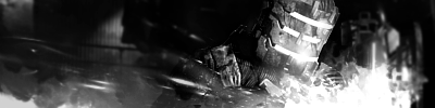
Work on the left side. It seems a little too empty.
Also, try making it a bit more dynamic. It seems too simple and bland. You could add some C4D's to give it a "wow" factor.

Welcome to Smashboards, the world's largest Super Smash Brothers community! Over 250,000 Smash Bros. fans from around the world have come to discuss these great games in over 19 million posts!
You are currently viewing our boards as a visitor. Click here to sign up right now and start on your path in the Smash community!
Work on the left side. It seems a little too empty.
I agree with the left side. If you want to keep that simplistic look, give it a similar colored design that flows well with the theme but keep it the same color, and make it look like someone "etched" it into the background. Hard to explain, hope you get what I'm trying to say.I haven't touched PS in months
Seems everyone is CnC covered
Well It's not finished yet, but can I have some advice on how to fix it and how to finish it **looks a bit brighter in PS which looks better imo :/


photoshop. i forgot to mention that.GIMP or Photoshop? Cause thats real good for a first sig. >_>
And I think it Might be a little big... Usually I use 380(w) by 127-130(h) But every person is different...
The text needs work, and yes most people on smashboards can read 12 font")
And I'm not sure if grunge sigs are still instyle but, its a real good start. :D

Critique someone else's tag before asking for critique.
Too boring, very lq, brushing looks pixely, hard-to-read-text, gross border. Read some tuts.
I tried a new style on this one.

/COLOR]
Kay, some tut.Post some tuts. >_>
For Zephron.
Sorry about that ^_^;;
@Sadow Moth: The render is bad because there is waaaaaay to much space between the arms and swords.
If you want a render standing out feel you need a more elaborate back ground... Take the sig that I made on page 6 or 5 for example.
If you're new to PS and are still looking to collect some C4Ds, check out this. Deviantart has loads of great C4Ds.T_T
Couldn't find an icy CD4...
If you're new to PS and are still looking to collect some C4Ds, check out this. Deviantart has loads of great C4Ds.
No problem. Google language tool ftw.OSHI-
ぼくわとてもうれし!
ありがとう!
You just saved me countless hours of searching google. Literally countless.
Thanks for the share. I'll use that. :DBTW this was the whole render.
Text placement could be higher and closer to the focal. The whole thing looks too one-sided. Maybe crop off a bit from the right to center Falco a bit and even everything out. I feel like there could be more emphasis on Falco because I'm sure you want people looking at him, rather than focusing on "ooh pretty fire thingy". Highlight him with some C4D's or soft brushes on linear dodge, etc.Someone critique this for me please.
Orly?And Zeprhon, for future reference, don't listen to what Dinkoman says. He hardly knows what he's talking about since he doesn't know what a good tag looks like.
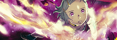
There's not much focus on luc, and he should be the focal
I tried a new style on this one.
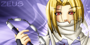
thank you, sir. I'll definitely work on it after a bit of laddering (they say you're too attached to your art in the first two hours after making it to make any major changes =D)Zeus, ummm, what were you going for? The flat colors match the flatly colored render, but the bg effect sucks. The only thing that helps is the rays coming from sheik. Text = EWWWWWWW!!!! Render plop? Yes.
Try burning the render a bit, cuz the light is coming from behind and yet there is definitive light on the render, especially on the hair
You can do better.
Sounds like something I would say.........(they say you're too attached to your art in the first two hours after making it to make any major changes =D)
haha, I actually heard it about writing, but found that it applies to art as well =PSounds like something I would say.........

Pretty much what I said on AiB; one thing I noticed you could do is get rid of the black brushing, and instead replace them with black grunge brushings. Blur them, then set em to merge. It can add a lot more depth, lighting, and attract more of your sig to the focal.haha, I actually heard it about writing, but found that it applies to art as well =P
EDIT: no one new, so erm...
I'll finish my other tonight or tomorrow. for now... cnc?
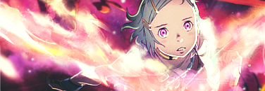
Beautiful sig. Vibrant colors, blurred/sharpened parts for depth. One thing I can say is that it looks scratchy all around.The splatters distract too much from the focal, as does the text and horribly contrasting background to focal colors. Better colors in the background are the biggest thing to do here, in my opinion.
New ones:
You always say that, and often times that's all you say. :|^V2 ftw, could use some better compo though.
I know, I always look like a snob whenever I say anything else though.You always say that, and often times that's all you say. :|

The compo seems kind of bad and I don't like the mass amounts of purple overlaying the render, try a dif render of dif colors imo. again, don't take me on my word with these real renders w/ fake bgs. I hate them and have a bad eye for the,
Hooray for having nothing better to do.

Trash it, I think... If not.... Clean it up, there's too much going on and it's hard to discern what that render is. The flow is pretty interrupted by the vertical smudging or whatever there on the left side (the red one). I'm not much of a wide color range person, so i would suggest simplifying the colors too.Much nicer. Now just kill the text and add some foreground effects. lol Well, that's what I would do, at least. =P
...Okay, I really need to get a life: