• Welcome to Smashboards, the world's largest Super Smash Brothers community! Over 250,000 Smash Bros. fans from around the world have come to discuss these great games in over 19 million posts!

    You are currently viewing our boards as a visitor. Click here to sign up right now and start on your path in the Smash community!

The Sig Critique Topic

Status
Not open for further replies.

deepseadiva

Bodybuilding Magical Girl
Joined
Mar 11, 2008
Messages
8,001
Location
CO
3DS FC
1779-0766-2622
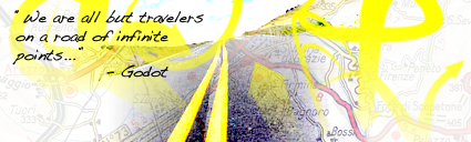
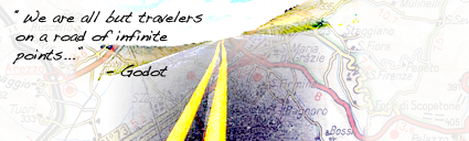
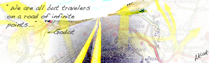
Akiak, it doesn't seem to have much flow. The road, the arrows, and the text conflict very heavily. And just curious, is the map of anywhere significant? It'd be cool if it was.

K, I need some major help now.

I've been stuck on this piece for months already. @______________@


I have elements I like, but I have on idea how I'm going to work in the text "Grey Clover" and three characters in it (the represented characters could be anything, symbols, portraits, slices, etc.). It's been a concept piece for awhile now, so I can rework anything, even completly if necessary - I just don't know how to make everything work.

HAAAAAALLLLPPPPP.... :urg:
 

Akiak

Smash Ace
Joined
Jul 28, 2007
Messages
820
Location
In my secret laboratory.
Nah, it's just a place close to where I live, in Italy. It was the one which fitted more into the sig.

Meno are you asking about what font to use or where to place the text?
If so, I would put "Grey" on the left in the small space on the bottom and clover on the over mirrored side.

More comments on mine?
 

1UPChris

Smash Journeyman
Joined
Feb 28, 2009
Messages
408
Location
Rogueport
@Akiak: I actually really like this tag. The only thing that would probably make it better is removing the random yellow streaks you added. They interrupt the flow of the street and just don't really fit. Everything else looks pretty nice.

@Meno: I'm really not sure how to help on this one. Maybe try stacking the text between the clovers, making the clovers larger, and placing the Triforce between the words Grey and Clover. I can't think of anything else to add. :urg:


Experiencing a huge creative slump atm. Oh, and this is a WIP.
 

Akiak

Smash Ace
Joined
Jul 28, 2007
Messages
820
Location
In my secret laboratory.
1upChris: I like the red spots and the C4D, but I don't think the render has anything to do with the rest of the sig. They're unrelated. You could try recoloring the render to something on the red to make it blend in better.

Anyway here's what happens when I remove the arrows:

Before:


After:


Do you think it's better?
 

Inyro Gatling

Smash Journeyman
Joined
Sep 1, 2008
Messages
229
Location
New York
Hm... I think you need to do something instead of a white background. Maybe try a topographic map?


Anyway, new:


=)
 

Neon Ness

Designated Procrastinator
Joined
Jul 10, 2008
Messages
3,631
@ Inyro: I don't know what to say about the first one. Honestly, there's not really much wrong with it.

It's so dreamlike. Really surreal, and for some reason the colors remind me of like dreams or something similar as well. The background is just a really nice view. The central lighting is a little bit overdone, now that I look.

Kudos.

@Akiak: The text is too... something. I don't really like the slant or size right now. On the fence about the actual font. On one hand simpler is normally better but for some reason the sort of freestyle look matches the quotation somehow...

The point of view is perfect, there're just some minor things that need changing... The roadmap idea is good, but try to lower the opacity some more and make it more subtle. I'd like to see the actual road more. Taking out the yellow arrows on the side was a good move. How about istead of flat white, you made the left and right sides sort of a night color scheme-- blacks, midnight blues, a few highlights etc. That might look good. Try to add like a gust of wind or something of the like blowing down the road, so it has that forlorn or "infinite" feeling to match the quotation. I think you could do something really cool with this.
 

Alzi

Smash Master
Joined
Feb 8, 2008
Messages
3,450
Location
New World

Inyro Gatling:

I do like the first one. Don't think theres much you can improve on. Maybe the left side needs some small touches. Not sure what to do though.

For the second one i think you should do somthing extreme near the gun or make it stand out alittle more. It might even look better with some text. I am also loving that first one you did one post above with the clouds and the house. I would say thats one of your best works so far.

As for me i made this awhile ago:


Along with:


And i made a new simple banner in my sig. To go with my avatar.
 

The Dinkoman

Smash Lord
Joined
Apr 13, 2008
Messages
1,277
Location
Back!

Akiak

Smash Ace
Joined
Jul 28, 2007
Messages
820
Location
In my secret laboratory.
Inyro (at the last two) the first one is real good. The colors match together nicely. There's nothing else I can say except maybe adding some text, but it might not be that relevant.
The second one is meh. The little you did with those colorful lights don't fit at all with the render and sometimes they need more blending, like on the hand. The idea as a whole is not something I would spend much time working on as it's not very original.

Thanks Neon, but the problem is that I stupidly merged a few too many layers so not that many changes were possible and the road map has to stay as it is. I made the arrows different and more transparent along with the text. And and added my name in the corner :)


Oh and I had no idea how to make the wind...
 

Lore

Infinite Gravity
BRoomer
Joined
Mar 5, 2008
Messages
14,135
Location
Formerly 'Werekill' and 'NeoTermina'
@1upchris: I think that there should be more blue in the background so it'll fit with the render better.

@Inyro: First tag of the 4 is phenomenal.

New tag from me, and it's the first I've made in about a month, lol.


Black Waltz

Smash Champion
Joined
Jan 27, 2007
Messages
2,243
Akiak: not feeling this one. It took me a while to understand what was going on. Putting quotes into tags is one of my pet peeves, make it prettier please.

Werekill: This isn't too bad, but there are way too many effects going around that don't really help out the tag. Clean it up a bit.

i only see 2 that are good. the 3rd to last and the the bleach one. >_>

-Horrible blending on first one
-2nd: color scheme doesnt seem to work and looks barely plotted on with hardly little blending
-3rd seems smudge and outline
as much as i suck i can tell what is good or whatnot at least unless im being arrogant lololol which true lol xD
At least try not to be arrogont/assume your better than us(even if its true) at least show it through your art and lets see what the people usually will say from that. 90% of the people here are not in art gfx forums but very little are. SuSa probably and me for all i know and some others that i dont know which might be lurking around and reading this rofl

imo your average to my eyes. To others you seem good. blargh dunno what else to do but to crit like a ***** rofl xD

only the 2 that i liked are actually good xD Im tired and felt liek being a ***** on crits rofl rofl anyway....Black Waltz where are you? T_T
Someone remembers me...I don't know if I should be flattered or not.

Anyhoo, I think XxGGnoRExX's tags are pretty good. The smudge technique particularly well done.

Referencing this post btw: http://www.smashboards.com/showpost.php?p=8426750&postcount=512
 

MojoMan

Smash Ace
Joined
Jun 1, 2008
Messages
975
Location
Brooklyn
hey guys. wemember me?
Akiak-sorry, have no idea what's goinjg on , text sux, and im confused. a lot.
im oddly attracted to that tag werekill. I think it was a meh-ish concept that was executed as well as it could be.
 

Yink

The Robo-PSIentist
Joined
Oct 6, 2009
Messages
7,419
Location
Osaka, Japan
NNID
SSBYink
Here, Dinkoman:

The blending of the render is great, but the left side is very empty. It doesn't balance with the right. Also try to keep the light source on on side of the render or in one spot.

It's a good sig though. :)
 

Black Waltz

Smash Champion
Joined
Jan 27, 2007
Messages
2,243
Here, Dinkoman:

The blending of the render is great, but the left side is very empty. It doesn't balance with the right. Also try to keep the light source on on side of the render or in one spot.

It's a good sig though. :) JK
*fixed.

Dinko: I see you're still making the same mistakes you were making over a year ago. Make your render not look like a blurry, bloody mess. It has no pop to it, it's very dull overall.
 

Diddyknight

Smash Lord
Joined
May 9, 2008
Messages
1,134
Location
Socal -> FL
Black Waltz! =D

lol Yeah, Gnorexxx are good after talking to him for a while lol
Where were you? I havent seen you pop in here for a while and kinda miss your tags >_>
 

Black Waltz

Smash Champion
Joined
Jan 27, 2007
Messages
2,243
Hey diddy, I've just been busy with college and ****. And I haven't had any inspiration to do anything really ever since GSA closed down.
I might start tagging again, but we'll see.
 

Yink

The Robo-PSIentist
Joined
Oct 6, 2009
Messages
7,419
Location
Osaka, Japan
NNID
SSBYink
Alright well the sig has two sides of flow which is a major no-no. Also the render is sort of blended but what is that thing going over the right arm? A clipping mask..? It's giving an awkward feel in composition. I do like how you chose somewhat complementory colors and the wireframe is alright but could be more subtle. (that's purely opinional)

EDIT: Lol B. Waltz, don't edit me plz. I believe there's always at least one good thing going on in a sig, I just give harsh CnC though.
 

PurDi

Smash Journeyman
Joined
Jul 22, 2009
Messages
342
Location
I don't really know anymore...
okay, second sig. I kinda just wanted to try out a hulk sig and experiment with effects.

It's definitely better than my first!


and don't go easy please (but do point out my good parts [if there are any]) I need all the help I can get!
 

Black Waltz

Smash Champion
Joined
Jan 27, 2007
Messages
2,243
Werekill: colors don't look bad, but there's no depth going on. There's no distinction between background and foreground. The BG effects just don't really look fitting, kinda splattery-messy and I don't dig that for this tag.

PurDi: Your Hulk render takes up way too much space in the tag and the duplicated, filtered render in the background is a definite no. If you're just starting with tagging, I would recommend staying away from text and looking up basic compo and color relationships and experimenting with that.
 

PurDi

Smash Journeyman
Joined
Jul 22, 2009
Messages
342
Location
I don't really know anymore...
Are you talking about that weird dot on the bottom left? I wanted to get rid of it but couldn't figure a way too, anyway I'm working on it some more.

And I understand color composition pretty well, I just didn't want to do a red or orange and purple was just hard to make flow...

I am changing it up though. And are there any tutorials, or do you have any suggestions for text? I don't really understand what's right and wrong with it...
 

momochuu

Smash Legend
Joined
May 8, 2008
Messages
12,868
NNID
Momochuu
3DS FC
2380-3247-9039


I'm new to sig making. >_< This is only the 4th one or so I've made. The first one that's not a sprite sig. I'd like some critique please.


Werekill- I like the color scheme, but that arm is throwing me off. For some reason, that's the first place I look. I love the background.
 

Yink

The Robo-PSIentist
Joined
Oct 6, 2009
Messages
7,419
Location
Osaka, Japan
NNID
SSBYink
What's wrong with the composition? No one is giving me advice...

Should I say, "Just work on that new one werekill. You did stuff wrong..." That doesn't help at all.
Let me try to help you. What I think they mean is the composition of your piece is messy. Clean it up a bit, maybe use less splatters. Also lets add some depth. A good way is to take the original render (or stock) and smudge it. I'd do that at least 2 times for blending. Use some blur type but don't over do it. If you blur the whole sig at this point and then you erase bits of it it gives more depth. C4D renders help too, but don't use too many.

I'd also look at your light sources. You should really only have one or two.

As for your text...text is usually a large problem for sigs because they disrupt flow and are very eye catching. (unless you wish it to be eye catching)

Did that help?
 

Black Waltz

Smash Champion
Joined
Jan 27, 2007
Messages
2,243
PurDi: text...stay away from it. Work on depth, and try to make your lighting sources more natural. A big star in the background seems out of place for lighting. The only advice I can give you on composition is to look at a lot of really good tags. Go here: http://www.smashboards.com/showthread.php?t=175790 and study them, see how everything fits together so perfectly and every element adds to the tag.

Werekill: Don't like how half of the body is strangely erased away. It just seems very flat to me. Try finding a more dynamic render so it has more pop to it.

Nya: Your colors aren't bad. The lighting is a bit strange and overpowered. The face especially is scarily bright.
 

SuSa

Banned via Administration
Joined
Jul 20, 2008
Messages
11,508
Location
planking while watching anime with Fino
K, made another one today. I KNOW it's better. Tell me what you think.


as always, cnc are welcome.

I'm getting better. Right?


EDIT: sorry for the double post...
I think your C&C you've gotten on this so far is rather poor. (No offence Yink)

First off, he was right about (what appears) to be Splatter. The top side splatter needs more depth. Try blurring the splatter to our left (demons? right) but leaving it sharper to where the text is. This should help a bit.

You misidentified your top side light source, you can tell from his shadow on his neck that it's ON TOP of him. You have it to the side, this will look poor. I like our left/his right side light source, but your other source should be lower. Below the dark shadow of the crevice of his neck.

You did a better job on text then most ever do, but the distance between it and the render attracts the eye. You don't want that. Try to add it a bit more lower, and a tad more to the left.

Also the lack of a border makes me :mad: it's a piece of art! Where is it's frame!

EDIT:
Also crop the right side where the end of the S currently is. I covered it up and it seemed to look better to me. :s (Just give it a shot =p) It will get rid of some of the negative space. (there's at tad to much)
 

1UPChris

Smash Journeyman
Joined
Feb 28, 2009
Messages
408
Location
Rogueport
Thanks SuSa, that actually helped a lot.

How's this?


The border may be a little thick but what do you think?
My eyes fly everywhere when I look at it. I like the C4D usage and how you created a nice flow, but the text sorta ruins it. I don't exactly get the two light sources beside your render either. I wouldn't use a border if I were you, it makes it look more novelty.


I was kinda going for an abstract tag, but I really don't know what to do with this. :ohwell:
 

Black Waltz

Smash Champion
Joined
Jan 27, 2007
Messages
2,243
PurDi: I wouldn't recommend borders, since you're cutting off part of your tag when you add one.

1UP: This isn't working out, it needs more depth and contrast.
 

SuSa

Banned via Administration
Joined
Jul 20, 2008
Messages
11,508
Location
planking while watching anime with Fino
Thanks SuSa, that actually helped a lot.

How's this?


The border may be a little thick but what do you think?
I need to teach you how to border.

1) Pick White/Black (it will almost ALWAYS be black... rarely a shade of grey either)

2) Select --> Select all (Or just hit Control+A)

3) Select --> Border

4) 1-2 Px (usually 1 PX is fine)

5) Brush around the edges with a solid brush

Make sure it's 100% opacity, and wallah. You have your border.

@1up
I never think a signature is complete without a border. Again, it's like having an unframed portrait or painting. You just never really see those. Especially if you have it hung up on a wall. ;)

I like the colors of the sig, but nothing really makes me go "wow", and there is a bit to much neg. space on both sides.

EDIT:
I'll add a border, and show what changes I'd make with just the... THE JPG?

ALWAYS SAVE AS A .PNG!!!! ALWAYS!!!! (Well, at least for graphics..)

EDIT 2:
Heres an example:


Few minor adjustments because I was bored:


PurDi

Smash Journeyman
Joined
Jul 22, 2009
Messages
342
Location
I don't really know anymore...
lol, sorry about the jpg thing. I guess my file hosting site converts images when I upload them.... I always save my photoshop images as png though.

What image hosting site is best?

and what exactly did you do on your adjustment?
 

SuSa

Banned via Administration
Joined
Jul 20, 2008
Messages
11,508
Location
planking while watching anime with Fino
I use Imageshack. =p

On my adjustments I added 3 Adjustment Layers. An Orange/Purple gradient map set to color and low opacity. A black/white gradient map set to Luminosity, again on low opacity. And a cooling filter on normal at middish opacity.
 

momochuu

Smash Legend
Joined
May 8, 2008
Messages
12,868
NNID
Momochuu
3DS FC
2380-3247-9039
I'd like some critique on that tag I posted a while back if that's okay with you guys. >_< I only got one that was very short.
 

SuSa

Banned via Administration
Joined
Jul 20, 2008
Messages
11,508
Location
planking while watching anime with Fino


I'm new to sig making. >_< This is only the 4th one or so I've made. The first one that's not a sprite sig. I'd like some critique please.


Werekill- I like the color scheme, but that arm is throwing me off. For some reason, that's the first place I look. I love the background.
Honestly, I don't know what part of the signature you made.
I'm horrible at commenting on vectors.

All I see is the Star/Sparkle brush. :s

Explain what you did a bit more?
 

momochuu

Smash Legend
Joined
May 8, 2008
Messages
12,868
NNID
Momochuu
3DS FC
2380-3247-9039
I don't know what you mean. :V I made that entire background. The arc-thing is a C4D.
 
Status
Not open for further replies.
Top Bottom