• Welcome to Smashboards, the world's largest Super Smash Brothers community! Over 250,000 Smash Bros. fans from around the world have come to discuss these great games in over 19 million posts!

    You are currently viewing our boards as a visitor. Click here to sign up right now and start on your path in the Smash community!

The Sig Critique Topic

Status
Not open for further replies.

Doof 07

Smash Rookie
Joined
Nov 21, 2009
Messages
3
Location
Nashville, TN
First I'd like to say that I really like a lot of these sigs here. I used to do sigs a few years ago and was pretty into it. I worked a lot more with brushes though rather than using so many filters and stuff like Inyro is doing. They look awesome, Inyro. If any of you would like to check out my photobucket to see my old stuff, here's the link:

http://s21.photobucket.com/albums/b272/nwallace07/

And here is a new one I just made. Trying to get back into the swing of things...relearn Photoshop and whatnot. Let me know what you think!


Yink

The Robo-PSIentist
Joined
Oct 6, 2009
Messages
7,419
Location
Osaka, Japan
NNID
SSBYink
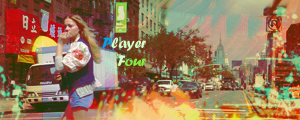
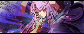
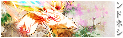
@Malik: These feel...totally different than your normal style. 2, 3 and 5 are very interesting. They have the same composition. I don't want to sound rude or anything and it isn't bad but did you use a tut for these? If not well done I have not seen sigs with bits of the middle part on the outer edges in awhile!

I'd be careful with sprite sigs, they usually requite a lot more effects to be pulled off well and as you have them I'd even sharpen the sprite more than they are.

The first sig you posted is the best out of all 5, imo.

@Roach: I'd say the same thing Inyro said and I'd also look up some tuts. They give many helpful tips! You can find them here > http://www.deviantart.com

There you can just type in the search bar "Photoshop (or Gimp) Tutorials" and you'll get a lot of results! :)

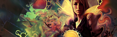
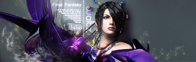
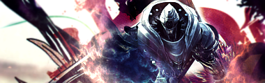
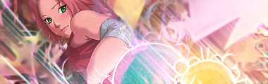
@ Inyro : Ok for the first sig, it's, very busy. Try to focus some of the effects to just stick around the focal to make it REALLY pop out at us. Basically the left side has too much going on, but I do want to say the render is blended very well with the sig.

EDIT: Also on the first sig, I'm not sure if that's a Liquify effect you used but I'd tone it down maybe a little, it gives the sig too many directions. That's opinional though.

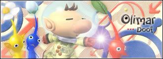
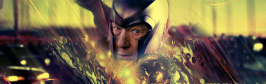
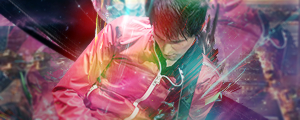
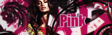
For the 2nd sig I see you've done something a lot of people do with sigs. "The Floating Head". Try to bring him out more than just the head, show some of his shoulders. Also work on some depth in that one, it's very flat. The text is good! Text is hard to do.

EDIT: I haven't made a "good" sig in a long time, but hopefully this is decent, what do you think?


I seem to have a love hate relationship with it.
 

lordunicorn3

Smash Journeyman
Joined
Mar 1, 2008
Messages
472
Location
Paris
Oo, have not been here for a while, seems to be active again =D
yink, its nice, but no clear focal, and the white splotch in the left corner is a bit overkill, maybe crop a bit out on the right as well, but not bad, (also a bit flat)

inryo, your work still amazes me, that 3rd one is amazing, one of the best i have seen in this thread (this, and the last incarnation)
 

Inyro Gatling

Smash Journeyman
Joined
Sep 1, 2008
Messages
229
Location
New York
Yink: I think this tag would be much better if the girl had some color, too, and the two of them became a dual focal. Right now, that bright yellow/orange is way too intense, it's distracting from everything else.

Speaking of "everything else", the effects aren't bad, but are too minimalistic. If you have your focal(s) taking up more than like, a third of the canvas, you should really consider using a lot more foreground effects to make up for the lack of background.


New tags ya?


Yink

The Robo-PSIentist
Joined
Oct 6, 2009
Messages
7,419
Location
Osaka, Japan
NNID
SSBYink
*Bows* Many thanks. I haven't made good sigs in awhile. Thanks to college taking up my time. (I wish we had a LP thread, I'd love to post some!)

ANYWAYS Inyro again: The first sig, has a blob of color on the right of Edward that is very, very distracting. The lighting is kind of weird and clean up some of the sparkles on Edward's face (under his nose and on his lips). It's a bit messy. The text isn't great either..maybe lower the opacity.

2nd Sig is really nice, you don't see many vertical tags. I don't really have anything too negative to say about it.

Here's one from me, again:


Neon Ness

Designated Procrastinator
Joined
Jul 10, 2008
Messages
3,631
(I wish we had a LP thread, I'd love to post some!)
We do. http://www.smashboards.com/showthread.php?t=235725 Anything goes here.

@ Inyro: In that 2nd one, you seem to like that typeface a lot... It's too hard to read in my opinion, most likely because the letters don't really have negative space... Looks sort of like an advertisement, nice subtle tones near the bottom. It's pretty simple and I think that's what you wanted.

Yink, Spring Mario tag's got good lighting. More emphasis on vertical motion? The text looks out of place for some reason. Try curving it around the contour of the spring a little.
 

Yink

The Robo-PSIentist
Joined
Oct 6, 2009
Messages
7,419
Location
Osaka, Japan
NNID
SSBYink
Just as a note, that Twilight tag was completely FOR TEH LULZ.
Lol, I think I figured that out after I finished typing and looked at all your other sigs :p

Ugh sorry to be offtopic but when I think about my generation, we're going to be remembered for liking glittery vampires. Sad day.
 

Inyro Gatling

Smash Journeyman
Joined
Sep 1, 2008
Messages
229
Location
New York
lol there's no smudging there at all. ^.^

And I'm not a fan of this one... depth and flow are missing, the focal's too centered in my opinion, and the lighting's non-existent too. Also, the colors are kinda bleh. But don't give up on this one. In my opinion, you can fix it up by really working to create a good flow and sprucing up the colors.

Also, you can call me _Dep lol, I don't mind. That's still my name on AQ forums (where I finally got my Creative title lol)
 

Black Waltz

Smash Champion
Joined
Jan 27, 2007
Messages
2,243
Inryo: Nice use of liquify, but it just seems a little awkward on the first tag, on the left there are small pixely particles that don't really go along with the whole mood. The second tag has a similar problem; there are these areas where there are sharp dividing lines on the left that don't seem to fit with the rest of the tag.

Werekill: The wireframe C4D has to go; doesn't work well. You have a bit of "floating-head syndrome" going on, where your all your render has been erased except for the head. I would imagine some brighter purples for the color scheme.
 

Neon Ness

Designated Procrastinator
Joined
Jul 10, 2008
Messages
3,631
Inyro, I commend you for using the liquify tool as well as you did. I have a lot of trouble with it... Hmm. I should try it out.

Lighting's pretty good in the second one. The mint green, orange, and red are working nicely together but other than those I think there may be too many colors. Or they're not all harmonized exactly, not sure. It's a great start, but I think it could even use some finishing touches. Maybe one more style of effects to make it feel complete.

@ Doof: The biggest issue is it feels flat. Nothing separates the foreground from the background drastically enough. It's pretty light as well, a few dark tones would up the contrast and look pretty good. Craftmanship looks okay, not bad at all. Nothing really interesting about the render, though, because they've been used so much...


Black Waltz

Smash Champion
Joined
Jan 27, 2007
Messages
2,243
Neon: You need to bring out your cube monster thing more. Right now it's sort of just creeping in the background. I want to see police response, helicopters, spotlights, etc. Imagine the Ghostbusters scene with the Marshmallow Man.

EDIT: Made an edit of an old tag for funsies:
 

Yink

The Robo-PSIentist
Joined
Oct 6, 2009
Messages
7,419
Location
Osaka, Japan
NNID
SSBYink
@ Inyro: I'm not a fan of your liquify style either, though the second one does look better. I don't like the render much, her face is just so dark and the blending is a bit odd. The colors are amazing

@ Were: I agree with the wireframe, it feels awkward. The lighting is spot on though!

@ Neon: Also, I agree with bringing the cubeman out, and maybe make your text a little easier to read. It's a cool sig

@ Waltz: What a nice sig! Very nice flow and the image fits well with your C4D, though near hear head that black shadow being cast (I think that's what it is?) is a bit overpowering. The sig is very balanced.
 

Doromac

Smash Journeyman
Joined
Aug 31, 2009
Messages
260
Location
Nashville
Inyro, what you did with liquify was amazing. It provided amazing depth and they both have excellent colors. Very appealing to the eye to me. Nice lighting as well.
I do agree with Waltz about the second tag though. The sharp lines and the smooth liquify doesn't work well together.

Neon, your tag seems a bit too plain for my taste. Nice concept and all, but I don't feel it was well executed.


Yink

The Robo-PSIentist
Joined
Oct 6, 2009
Messages
7,419
Location
Osaka, Japan
NNID
SSBYink
@Doro: The text in your sig is nice but I think it would've been better if it was flowing the same way as your C4D. This is pretty simple, no really interesting effects, though simple can be nice.

I try to stay away from Black and white sigs, because I feel they can hide mistakes. But I've seen Tankmen and I know they're black and white.

One last thing, the boarder. Add another black one to the side. Leaving one boarder piece feels very odd and looks odd too.

Overall, nice job.
 

Smash G 0 D

Leave Luck to Heaven
BRoomer
Joined
Oct 5, 2005
Messages
3,571
Location
Charlottesville, VA
That empty space is really bothering me >_<

A
dd maybe more faded sparkles (more faded than the others) or a shape or something..

m
e new thingy


Neon Ness

Designated Procrastinator
Joined
Jul 10, 2008
Messages
3,631
@ Black Waltz: Yeah, I think removing the wireframe was a good move. It didn't really fit. It looks good, I like the contrast on her face. That shadow is really bugging me for some odd reason. Why is it there? Is she supposed to be leaning against a wall? It does... something with the depth that I can't tell if it's good or bad.

Mind if ask what typeface that is (the one for "Waltz" and "Lulu")? 's pretty snazzy.

@ Smash G 0 D: Yeah, that's definitely cool, and I hate Lady Gaga. It's a little hard on the eyes when you first see it but oddly for the same reason it makes it stand out nicely. The text is the only problem. It needs more... something. It's just there. Alter the color of the letters to add depth and variation, maybe try to make them match her other eye, but still readable. Nice!

Tried taking everyone's advice about lighting/blandness. I think I'm still gonna try out the helicopters as well, but how's this so far? Lighting okay, not too strong? Are the buildings okay? Are there depth problems? More/Not enough spotlights? Colors working together? Text readable? Seriously, rip it to pieces. I want to make sure I can fix any and every thing that needs it.


lordunicorn3

Smash Journeyman
Joined
Mar 1, 2008
Messages
472
Location
Paris
wow, its been a while =]
ill post some stooph later, been making tags again

@ Neon Ness

I really, really like that tag.
Its simple, not too many effects or too much lighting, and very cool to look at.
Maybe add a couple more stars, that about all i can say. The text is readable, but a little small, the spotlights are good, 3 is a good number.
 

Lore

Infinite Gravity
BRoomer
Joined
Mar 5, 2008
Messages
14,135
Location
Formerly 'Werekill' and 'NeoTermina'
Get rid of the text, Neon Ness, and it'll be a lot better. Also, try darkening the buildings in front of it a little, they distract from the cube monster, and they just don't really fit. >_>

New tag, rip it apart with CnC please.


Black Waltz

Smash Champion
Joined
Jan 27, 2007
Messages
2,243
Neon: Good job adding the lights. I would recommend changing the color of your font for "cubism". When the text is that far from the focal and you make it a complimentary base, it looks a bit awkward. Maybe tone down a bit of the saturation as well.
And also, here is the link to the font that you asked for: http://www.dafont.com/mamma-gamma.font

Werekill: A little too messy at the bottom. I'm not keen on the solid dark blue that you have at the far left; it contrasts way too sharply with the brightness of the rest of the tag. Adding a few soft light neon highlights around the focal would be a nice addition.
 

Neon Ness

Designated Procrastinator
Joined
Jul 10, 2008
Messages
3,631
Whoa, lotta colors, Werekill. I noticed them before I even noticed what was going on in the signature. I think the first order of business is to get rid of most of those colors and only use a few that'll create a cohesive color scheme. Probably something that includes pink since that seems to be the color of his jacket.

Depth is good, but the direction of the lines is... odd. I see a perpindicular crossover behind him that's disorienting. I think you should remove the black streak for now.

Okay, last iteration of this one. I appreciate everyone's advice so far.

V3: Different font color, added some choppas. I dunno, I don't really like the helicopters much. It was a good idea, but I can't seem to pull it off well. I wanna see what others think...


V4


V5


I toned down the brightness of the left group of skyscrapers in all of these.
 

Inyro Gatling

Smash Journeyman
Joined
Sep 1, 2008
Messages
229
Location
New York
I like the tag without the choppers, Neon, but you really need to fix the lighting. Right now, the lights all seem to be landing on the focal's face, yet that's one of the darkest parts of the focal...
 

Yink

The Robo-PSIentist
Joined
Oct 6, 2009
Messages
7,419
Location
Osaka, Japan
NNID
SSBYink
@Neon: Last one looks very nice, I wish you would've found somewhere to put the text. :( (I like seeing text in sigs...)

@Inyro: The first tag is very pretty, but it's very yellow too. TOO yellow at the bottom. Adjust your brightness or your colors.

@Were: The tag has a lot of interesting colors. And I love the effects on your guy, but the C4D in the backround is very distracting, and doesn't fit with your other flow. I think if you removed it this would look amazing.

Here's another from me, I tried a simpler style:


Can't decide if I like it or not.
 

PurDi

Smash Journeyman
Joined
Jul 22, 2009
Messages
342
Location
I don't really know anymore...
Nice Yink, though I'm a little biased on Okami sigs. They just inspire great art.

The C4D on the left is a bit odd but I see why you added it in.
Grrr... It's so simple that I can't really find anything to critique...

And just curious, does the text on the right actually mean something?
 

Lore

Infinite Gravity
BRoomer
Joined
Mar 5, 2008
Messages
14,135
Location
Formerly 'Werekill' and 'NeoTermina'
Yink, the bit of Kana (or kanji, my japanese is really rusty) on the right distracts from the focal.

Last version, I swear. I meant for it to be like this anyway, but I was curious to see if I could pull off two different directions for my flow.


Inyro Gatling

Smash Journeyman
Joined
Sep 1, 2008
Messages
229
Location
New York
Honestly, I'm not a huge fan of it, Were. The colors don't all go together, and there's really no depth. You also killed the flow with the c4d going vertical over the focal.

Pink:

Sakura:


Making these made me want to frolic through two fields of flowers.
 

Neon Ness

Designated Procrastinator
Joined
Jul 10, 2008
Messages
3,631
@ Yink: I think there are a lot of strong points to this one. Those outlines really have that Okami/illustrated feel, which is good. I also think you did a good job with the colors, there are a lot of different ones but they still work--maybe because the white balances them. Overall it just feels really sharp. *applaudes*

@ Inyro: Why is the text blurred? It makes the depth of field confusing... The bluriness makes it look far away but it's physically obscuring some parts in front of the woman... It looks like a spatial impossibility. :dizzy: 
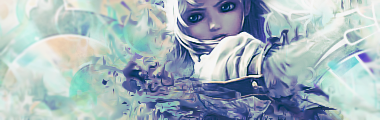
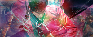
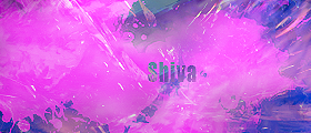
I dunno where it's supposed to be. The text's also pretty big, and I wish it had more... something to make it interesting.

I like where the composition could go. She's blending into the environment well, I just wanna see more work on the environmemt. It needs just a little more variation besides the pink/white, I think... something that ties them together more. Same with the text, though, why is so much of it blurry?

@ Werekill: Abstract? Nice, don't see a lot of those, I'd like to see where this goes. I don't even think abstract pieces need text, because, well... they're abstract. I guess I'm just wondering what Shiva has to do with anything. It's sort of tall and awkward where it is now, it just doesn't seem congruous.

Could you try blending the colors more? There are sharp boundaries bewteen colors that don't really look... right. It looks like you had some cool blending but then took a low opacity hot pink splatter brush and covered the whole thing. So now it's mostly one color... It just needs something a little more eyecatching somewhere in there and some color blending.

Phew...
 

MojoMan

Smash Ace
Joined
Jun 1, 2008
Messages
975
Location
Brooklyn
hey guys, guess who's back? back again? Shady's back. Tell a friend.
Werekill: Errrr, I'm really not sure what to make of it. It's a really odd abstract. I guess it has some nice contrast.


coming back 2 u with a vector from the movie avatar.
 

Player-4

See you in 25 years
Joined
May 16, 2009
Messages
5,582
Location
Campgrounds, TX
Hey guys, first time here and I just wanted to get some feedback from people :).

So I would love some CnC on this


Go easy :p
 
Status
Not open for further replies.
Top Bottom