Zephramrill
Smash Lord
you kids and your fancy photoshop.

Welcome to Smashboards, the world's largest Super Smash Brothers community! Over 250,000 Smash Bros. fans from around the world have come to discuss these great games in over 19 million posts!
You are currently viewing our boards as a visitor. Click here to sign up right now and start on your path in the Smash community!
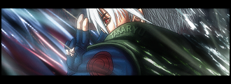
lol I'm going to paint my controller soon too =3 I have a few ideas...lol it was dull without the lense flare.
and its kidna like.. sun like..
and id put teh redner mostly infornt of the flare anyways. i think it would work well with a bowser. lol
yeahhhh if anyone wants backgrounds for stuff im board alot.. or if anyone wants a sig. il eventualy amke a nice crew sig once we all have our disease names ect. and i might make a team sig for my and steve.
im thinking about making sum shirts to sell at next tourney, i heard she made a killing with those shirts. and il one up sliq and sell my shels. (i have 4 controlers coming to me in abotu a week for free heck yes)
im also going to look into doing wii motes (top only for now) il take one apart and see what id have to do.
Steve im ready to do your controler givve me your black controler and the money. im going metalic red black stars. posibly put your name sumwhere in black. or a small logo. il think of somthing that looks ill.
Chris. you wanted metalic yellow with pink stripes?
i think tahts doable. uhmm we can work out a price.
i feel kinda weird cuz my controler wont be the only 1337 one anymore.
*note*
Im not cutting any windows. thast my thing. i like being unique.

yeah alot of people have told me that simple text is the best way to go, but my bg is supposed to have the effect of a broken screen, so you'd probably understand that it looks so gay and out of place if I just put it there with no after-thought.Text is the most frustrating part of the sig in my experience...... There's one easy thing to know about it, though. When you work with renders and backgrounds, you can focus on either of them and do whatever you want with the blending of it. For text, most of the time you just need to make it really, really simple and just blend. It never has to really stand out. A lot of people will tell you that keeping text simple is the best thing you can do then using crazy big font.


Lol that's from Mona the Vampire.you and steve should be sam and ella for teams.
Lol, that's the only reason I was offering $50 =P.Im not cutting any windows. thast my thing. i like being unique.
OMFG I LOVE IT.got bored really bored
http://i6.photobucket.com/albums/y220/KotoHaru/Sigs/Feebas-Sig.png <--- black text
http://i6.photobucket.com/albums/y220/KotoHaru/Sigs/Feebas-Sig3.png <-- lip coloured text
be grateful stvn, i actually dids it LOL
****ted on the text....... **** text
first time working with vector shiz, kinda hard organizing stuff and making them look nice >_<
also, stop using that raichu *****, use this instead.
i think i should make a snowflaek societah sign and stick it in there later.......
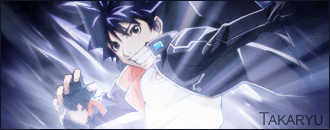
 -SUP3RCANS1R
HEY, THAT ALMOST LOOKS LIKE THOSE X-RAYS. JUST ALMOST./
\
/
they don't have magikarp either.
no you dont ily.I didn't go.
I guess I suck.
Stos can you PM me bernie's cell number?


Who said I wanted it for brawl, I just want it to look cooler than all white. OH GOD SILVER GC CONTROLLERSoh god wii motes -.-