• Welcome to Smashboards, the world's largest Super Smash Brothers community! Over 250,000 Smash Bros. fans from around the world have come to discuss these great games in over 19 million posts!

    You are currently viewing our boards as a visitor. Click here to sign up right now and start on your path in the Smash community!

Official Critique Topic

HybridTheory

Smash Cadet
Joined
May 29, 2008
Messages
25
Location
Alpharetta, GA
@Samo

I like the portrait, the skin tones are great. I might suggest lightening up on the pencil a bit. The contour lines seem a little on the darker side in some places! Other that that GJ.


it's a work in progress, I need to tidy up the hair some...
 

Cosmo!

nerf zelda's dsmash
Joined
Feb 5, 2008
Messages
2,368
Location
Chicago, Illinois
I don't know, I just thought it was kind of mean to say it's flat without being specific(color dimensions have high and low levels) as to how it could look better. :-p But I'm not an artist so what do I know? lol
it wasn't mean, it was honest.
 

Lythium

underachiever
BRoomer
Joined
Mar 6, 2009
Messages
17,012
Location
Halifax, Nova Scotia
Hybrid, that is fantastic.

My only issue with it is that it's a bit difficult to see the definition in her lips. Maybe a bit of a darker tint would work better?

I can't wait to see the finished product. :)
 

Ocho(*8*)

Smash Ace
Joined
Jun 30, 2009
Messages
514
Wow, those were awesome.

I really like how you drew wrinkles in the fabric on some of those. I like everything else too really.

I am inspired.
 

HybridTheory

Smash Cadet
Joined
May 29, 2008
Messages
25
Location
Alpharetta, GA
Sinking.... wow, are the first 2 charcoal? They are excellent. I really love the contrast in your b/w pieces. Absolutely stunning.

Yes the hair is unfinished, and I'm putting that piece on hold (this happens a lot)

but started another :D


PMKNG

Smash Ace
Joined
Jul 16, 2008
Messages
534
Location
Miami, Florida
NNID
GalickGon
cool br0
hope her eyebrow doesnt look like a bush though.
love how the subjects right eye came out so far
 

SinkingHigher

Smash Lord
Joined
May 4, 2008
Messages
1,886
Location
Canada
Thanks Hybrid :D

They're actually just regular pencil. I used a 9B graphite stick to do the solid black parts a little quicker, but essentially that's just a really fat pencil.

What program are you using to do the vector art btw? I never really got into it but they're quite epic. I tried it once and I couldn't draw a circle so I kinda gave up :p

Are you using reference photos btw? I'm just curious. The proportions and alignment in the face are perfect.
 

L__

Smash Master
Joined
Nov 5, 2007
Messages
4,459
Location
flopmerica
Sinking.... wow, are the first 2 charcoal? They are excellent. I really love the contrast in your b/w pieces. Absolutely stunning.

Yes the hair is unfinished, and I'm putting that piece on hold (this happens a lot)

but started another :D

The detail on this is so good...I don't really know what to critique lol.


:|

It's been awhile since I've done anything...I've tried some other pieces but they're all terrible
 

A17

Smash Ace
Joined
Jun 7, 2009
Messages
792
Location
ON, Canada
NNID
Okrapaeli
Those vectors done on illustrator, hybridtheory?

Here's a WIP I dropped, but anyone is welcome to pick it up and continue. The red was killing my eyes and brawl was too addictive during the summer.


Basic tracing of a photo, done on illustrator.
 

Neon Ness

Designated Procrastinator
Joined
Jul 10, 2008
Messages
3,631
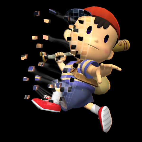
Put them junks in this thread. http://www.smashboards.com/showthread.php?t=235708 More sigmakers would probably be more likely to see it... It looks real good, though, the colors are really working together. I also appreciate how the splatters there aren't overdone. It's easy to go crazy with splatter brushes... or at least for me it is. :/ Something about the lighting seems off, though, like there should be a little light on the upper right. I can't tell exactly. That bright streak of light on the left near his finger is... awesome.

A17, great lighting on that vector. I don't think the red's too vibrant. For some reason vectors look really nice with outlines to me. Probably why I like HybridTheory's stuff so much. :laugh: Only thing I see, and this is pretty nitpicky, is that there's a little red out of the lines on the front window... like on the left corner. Other than that the progress looks good. You oughta finish the whole thing if possible. I wish I could vector like that.

This thread died for a long time...
 

PMKNG

Smash Ace
Joined
Jul 16, 2008
Messages
534
Location
Miami, Florida
NNID
GalickGon
i did not see the spiderman post, on the other page.
I like the img, source pl0z

and maybe just a TAD bit of contrast between the gloves and the leg, idk for me its getting a bit blended together; may just be cause of my monitor though
 

L__

Smash Master
Joined
Nov 5, 2007
Messages
4,459
Location
flopmerica
I posted it here in case someone else wanted to use it


Credits to Spoon on PlanetRenders.net for the render... if it wasn't obvious enough
 

Yink

The Robo-PSIentist
Joined
Oct 6, 2009
Messages
7,419
Location
Osaka, Japan
NNID
SSBYink
Wow, sorry for the HUGE bump but... : (I lowered the size for the forum)


What do you guys think?
 

Neon Ness

Designated Procrastinator
Joined
Jul 10, 2008
Messages
3,631
Actually, sigs are specifically supposed to go in this thread. http://www.smashboards.com/showthread.php?t=235708 For future reference.

But since it's already here. Hmm. Well, it's not horrible. Are you just starting out with GIMP? If so, then it's not too bad.

Just basic stuff, add more colors than just the one green. If you want an analogous scheme, try some yellow-greens and blue-greens, which I think would like pretty nice. Clean up the outline on Kirby because it's a little messy. Get rid of the text for now, that'll take some time to learn. Start out with those and I'd like to see it reposted in the other thread, if you want further advice. Didn't want to overwhelm you.

Also, for reference of what a good sig is, look here: http://www.smashboards.com/showthread.php?t=175790 It might help to browse for a little inspiration.

Oh, and remember the golden rule(s).

Livvers said:
DEACTIVATE YOUR SIGNATURE IN THIS TOPIC

And try to give other people some helpful comments before demanding feedback. If you genuinely can't think of something to say, fine. Don't stretch yourself. But at least try.
 

Yink

The Robo-PSIentist
Joined
Oct 6, 2009
Messages
7,419
Location
Osaka, Japan
NNID
SSBYink
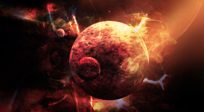
This is awesome, how did you make it?
With Photoshop CS4 and Cinema4Dimension, and a photo of a hand and a bubble wand. :)

EDIT: @TD: Really? I suppose I can clean it up a little! Thanks, I'll remake it later on this semester.
 

Yink

The Robo-PSIentist
Joined
Oct 6, 2009
Messages
7,419
Location
Osaka, Japan
NNID
SSBYink
So you made the C4D from scratch?
Sadly no, I touched up an image off of a free stock site for each planet. I tried to make them a little more detailed, like on the Earth's continents. I do however, know how to make C4Ds from scratch, I just hate doing it because it takes up a lot of time, especially with reflections...

EDIT: @TD: I like the idea, it's really strange, and interesting. On the sword though, clean up the ending of the (pen tool?) you used. It just kind of cuts off. I like the the creature, because I love black and white.

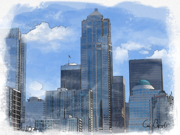
Here's another from me (Use the original shot taken by myself for comparison):

ORIGINAL SHOT

The Revise:


Totally made in Photoshop. I gave it a water color effect feel.
 

Diddyknight

Smash Lord
Joined
May 9, 2008
Messages
1,134
Location
Socal -> FL
There shuld be art of the week. It should be intresting :3
@Yink: cool effects. I never got into large pieces in full detail so I really don't know what to look for =\
 

Neon Ness

Designated Procrastinator
Joined
Jul 10, 2008
Messages
3,631
SIG SHOPPE GO! http://www.smashboards.com/showthread.php?t=235708 Actually, I'm not sure I'd consider that a sig because of the size, but... *shrug*

Why is he standing in a forest? It doesn't seem to fit.

The colors are good right now. Try out some that relate to his outfit like black, white, or gold. This is if you plan on changing the background, I guess. I actually think you did a good job cutting him out (except there's something weird near his right leg...), but the picture quality is sort of ehh. It doesn't stand out enough to me, seeing as how he's the main focal point. Might want to find a higher quality picture, or blurring some areas of the background so he's pulled forward more.

Low opacity text is normally not a good idea... The font is a bit over the top also.
 

Dr_Twist

Smash Lord
Joined
Oct 6, 2006
Messages
1,110
Location
Iowa-gimme some brawl challengers yo!
i would CnC but im not sure what it is? lol
i think it looks kinda cool but no sure what to say to critique. if there needs to be flow in other hings then sigs then its a bit lacking in that but the solar flare ish effect is good. the negative space is kinda random and maybe too negative, i would say make them smaller.

edit: posted elsewhere
 

A17

Smash Ace
Joined
Jun 7, 2009
Messages
792
Location
ON, Canada
NNID
Okrapaeli
Hurray Life Drawings! The Proportions constantly feel awkward to me, I would like some feedback as to what is wrong and what I should do please.


Neon Ness

Designated Procrastinator
Joined
Jul 10, 2008
Messages
3,631
Figure drawing, eh...

The form is really good for the most part. The sketchy lines look great as well. Something that stands out in all of them is that his right shoulder (our left) looks too close to his head. Like we should be able to see a bit more of his back muscle. Foreshortening is overexaggerated in the middle-left sketch, looks like, on his right hand. It's as big as his head. o_O

Bottom sketch is the most refined, definitely. The hand looks better, but his thumb is too far up his hand (which by the way needs to be flattened more to the floor plane a little more). The right arm perspective is great on this one.

I still have trouble with getting perspective/anatomy right. :embarrass I haven't hand drawn anything in a while...
 

Yink

The Robo-PSIentist
Joined
Oct 6, 2009
Messages
7,419
Location
Osaka, Japan
NNID
SSBYink
Here we are:


Made for the Ness Frame Data thread. Hope it looks alright. Took FOREVER to do.
 

Geist

Smash Master
Joined
Sep 26, 2007
Messages
4,893
Location
Menswear section
Hey guys, I'm starting work on my new college portfolio for game design. Both are works in progress, tell me what you think.


A17

Smash Ace
Joined
Jun 7, 2009
Messages
792
Location
ON, Canada
NNID
Okrapaeli
Although I understand how, the Saleen's perspective is still overly stretched.
 

Geist

Smash Master
Joined
Sep 26, 2007
Messages
4,893
Location
Menswear section
Haha, well I thought my original reference was a bit boring, so I exaggerated the proportions a bit (maybe too much) by hand. I screwed up the rim though dammit.
 

Akako

Smash Rookie
Joined
Feb 17, 2010
Messages
14
I'm going to post some artwork for critique.
^^;;; Don't chew me apart too much. I haven't drawn much since I've been trying to get better at brawl(lolz). But I gave it another shot...Sunday...and this is what I came up with.


Sorry that it is big. ^^;;;;;
 
Top Bottom